ABOVE & BELOW
Indie Game Summer Project.
INTRODUCTION 1.0
For OFT games’ first official project, Willow and I
decided to work on a game over the summer. Originally,
our we were going to start working on our ‘dream project’
but decided that a narrative-based zombie shooter was a bit
ambitious, considering our lack of knowledge of unreal engine.
We decided to return to the drawing board,
trying to come up with a project that was simple
enough for it to be a learning curve, and allow
us to pick up the basics during creation, but also
something that we could explore creatively: both
mine and Willow’s passion is in concept art, not
necessarily programming and development, so we wanted
something with a distinct style.
We began to think of ideas for simple two-player co-op
platformers, and eventually decided on an idea. There
would be two characters, and they would be in two different
lanes (one forward, one backward), and would have to work
together to solve puzzles, and remove obstacles from the
others’ path.
As for aesthetics, we decided to set the game in a
forest. We also decided to draw some inspiration from
my rejected goblin designs from my ‘Alchemist’s Garden’
project, with the simple look of an indie game protagonist.
We knew early on that we would be creating the models
ourselves, so we wanted them to be simple as we had
limited Blender experience.
CHARACTER DESIGN 1.1
For the characters, we had a rough idea of what we
wanted from our brainstorming session: The character
in the background was going to be larger than the one
in the foreground and would be some kind of ‘forest
guardian’. The one in the foreground would be regular-
sized and would likely be inspired by a Dungeons and
Dragons race: specifically, Elf or Tiefling. Willow
designed her character first, and I used it- along
side the Alchemist’s Garden illustration- as references
for the piece.
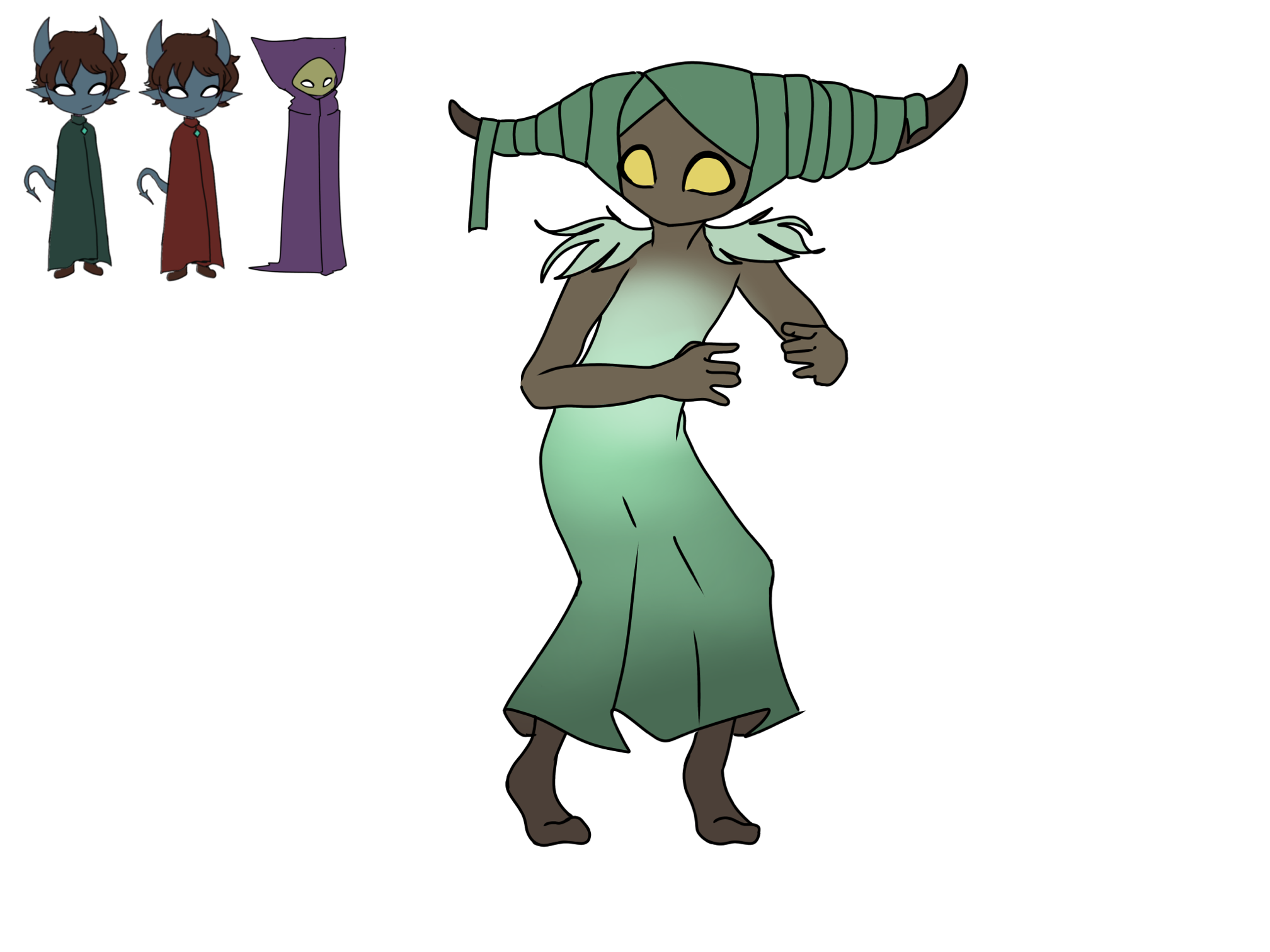
Figure 1.1.1, Initial Design
Originally, I tried to imitate the triangular
shape of the hood on the goblin design by giving
the character horns wrapped with fabric. This design
was just me illustrating the first things that came
to mind, but I didn’t really like how it turned out.
From here, I took the aspects that I did like – the
horns, the yellow eyes, and the flowy dress- and created
another design.
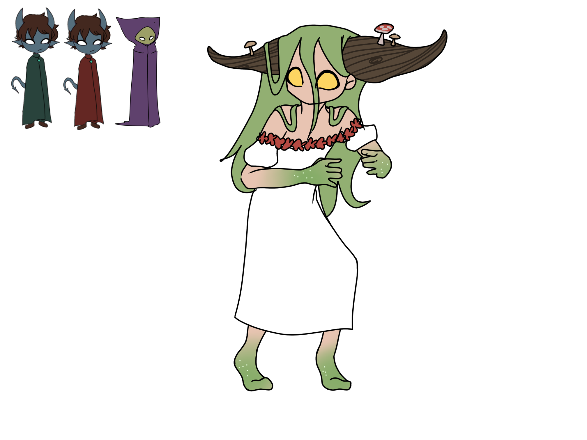
Figure 1.1.2, Second Design
I liked this one a lot more than the first,
in fact, I thought it really captured the
appearance of a woodland guardian, especially
the little mushrooms on the wooden horns. From
here, I tried many colour variants for this design:
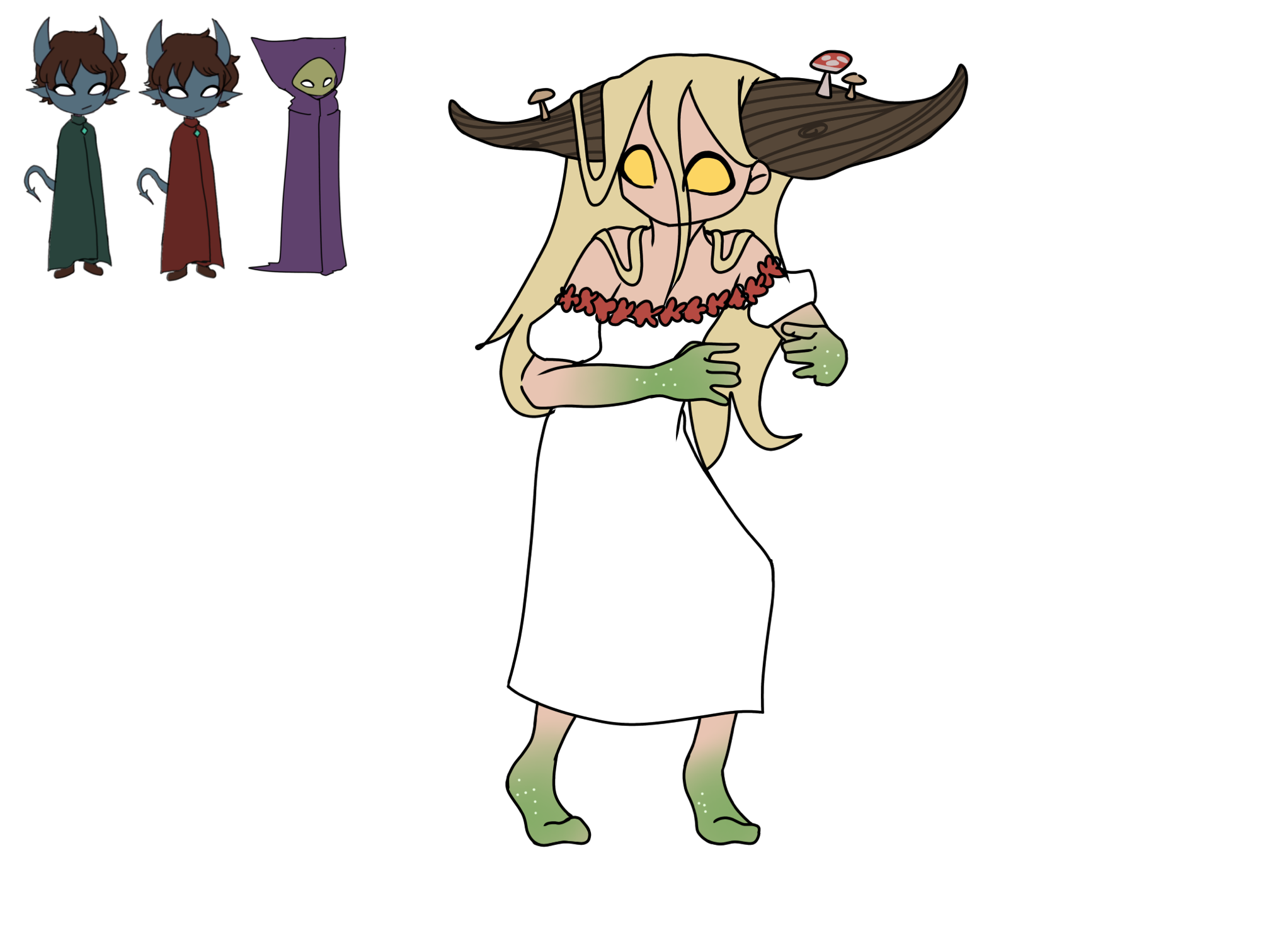
Figure 1.1.3, Colour Experiment 1
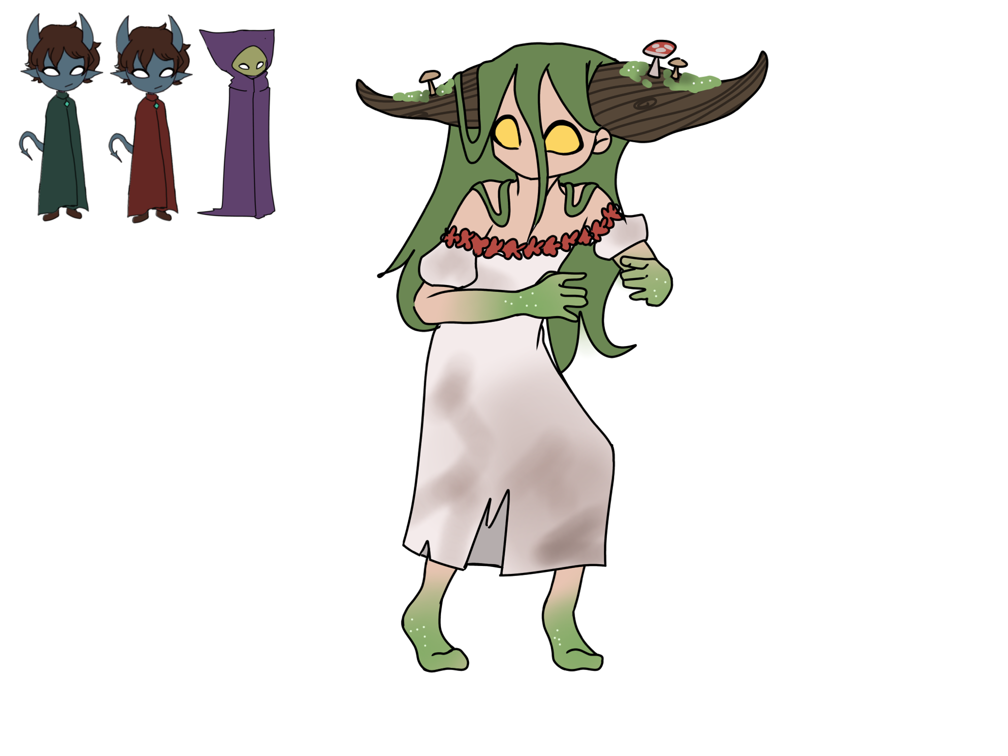
Figure 1.1.4, Colour Experiment 2
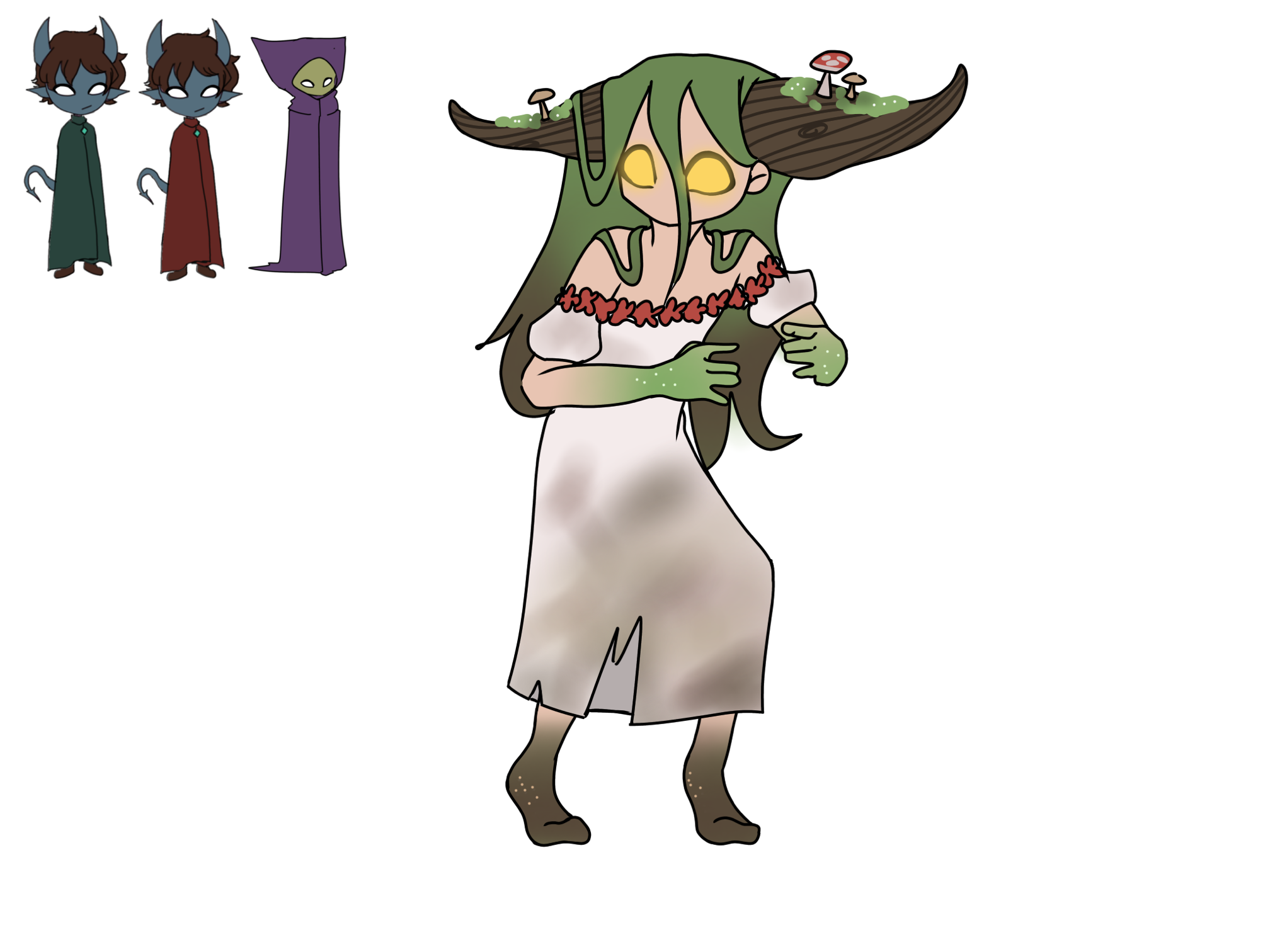
Figure 1.1.5, Colour Experiment 3
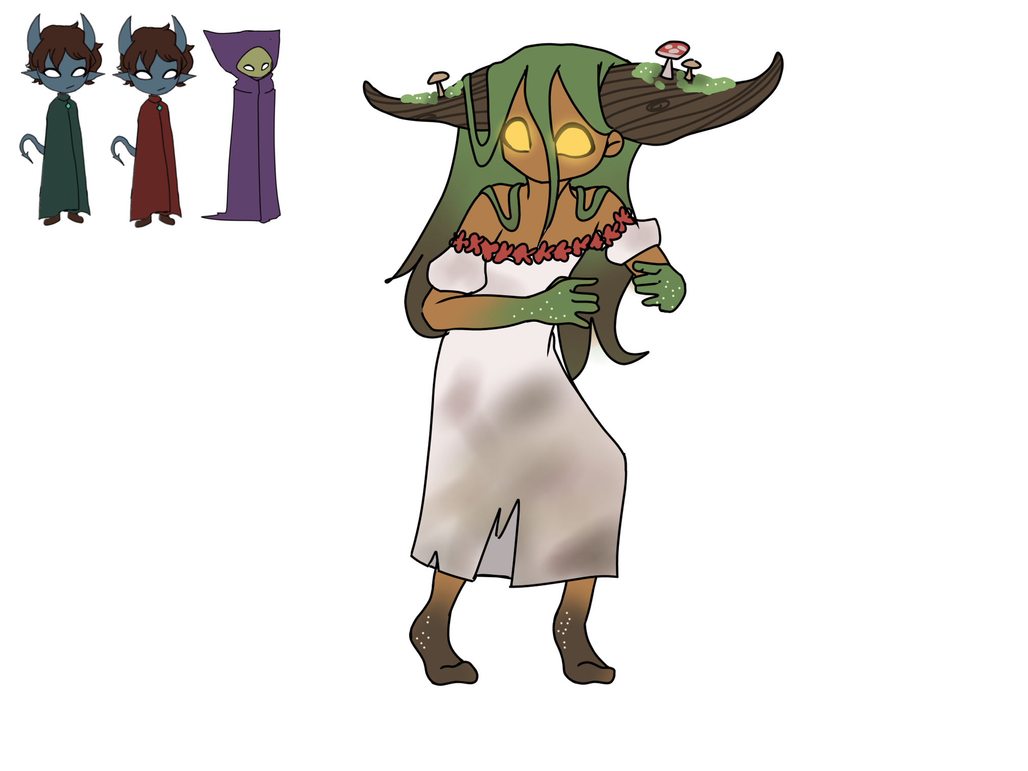
Figure 1.1.6, Colour Experiment 4
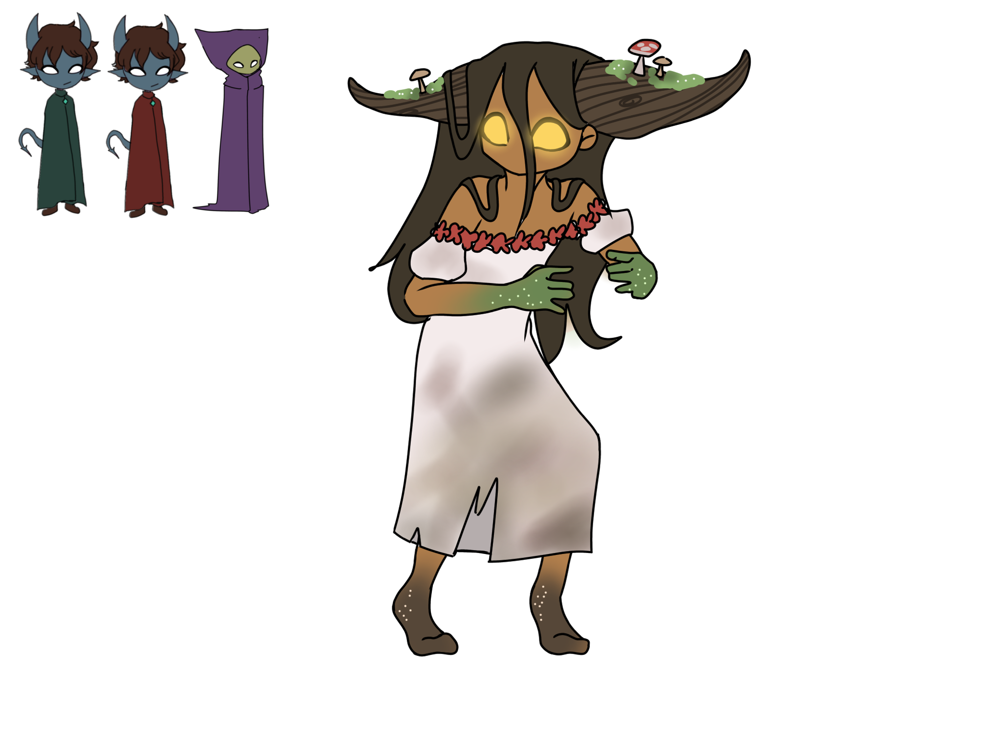
Figure 1.1.7, Colour Experiment 5
I ended up going with a darker skin tone, as I
felt it made the yellow eyes stand out very nicely,
and I also ended up opting for the darker hair, as
I felt it blended into her horns nicely, and caused
the green to be more of an accent colour, like the
red. With this design mostly finalised, I created a
few more designs using a different illustration:
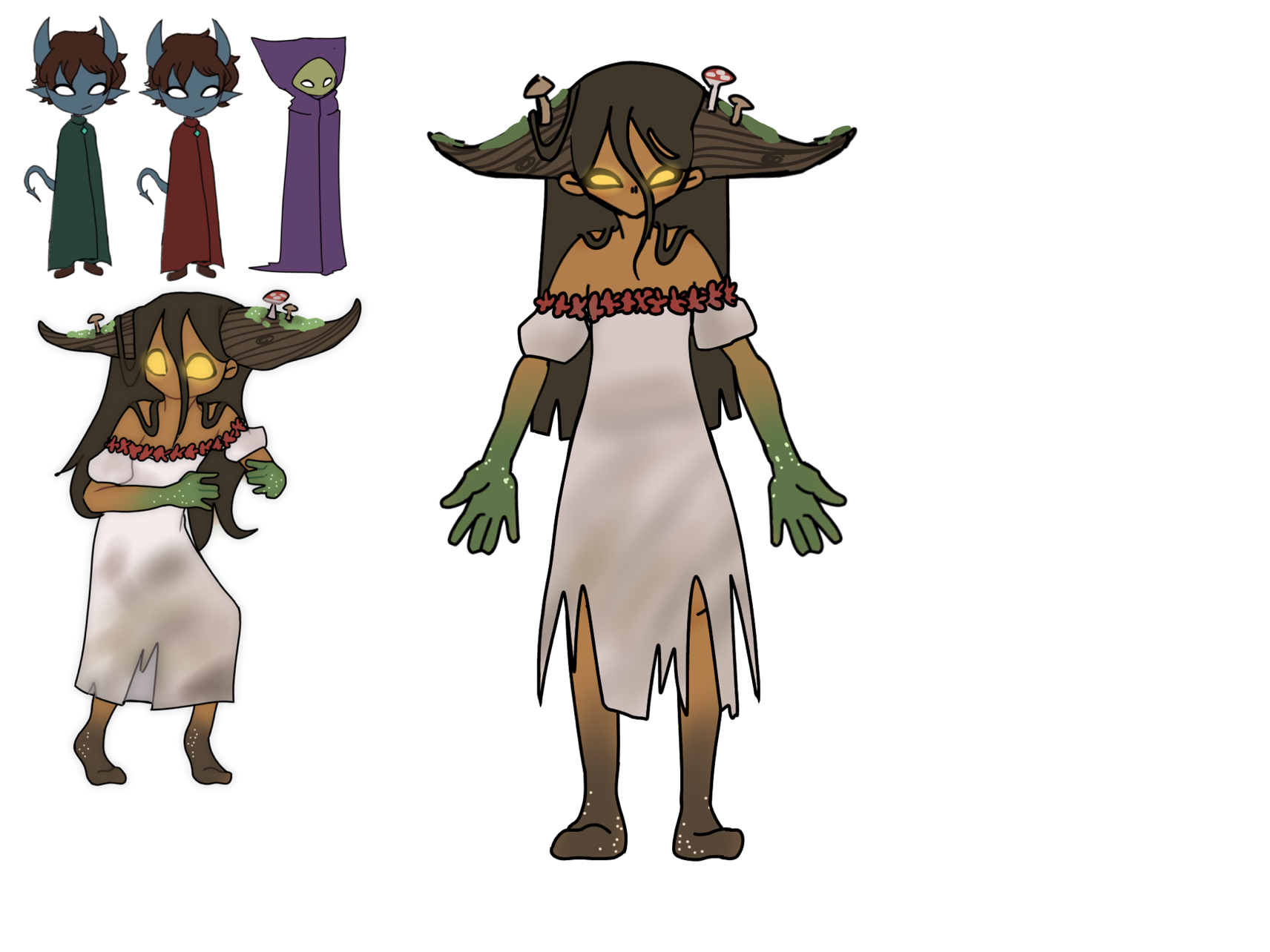
Figure 1.1.8, Full-Body Design
The first things I changed were making the dress
more torn and making the hair more choppy at the
bottom to make it appear wet. My idea for this
character had shifted slightly, from more of a
‘forest guardian’ to a ‘swamp guardian’. I also
made her eyes smaller- if she was going to appear
as a kind of mother nature figure, I wanted her to
appear more maternal and older- the large eyes made
her look more skittish and younger, which wasn’t
what I was going for.
I tried a few more experiments using this illustration:
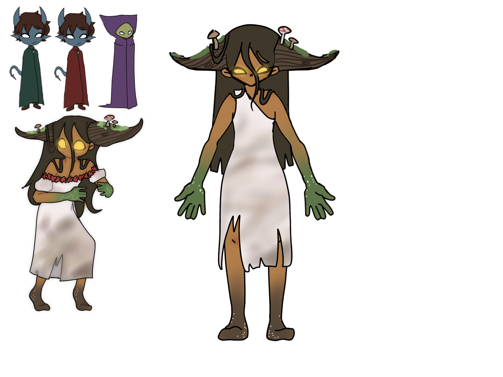
Figure 1.1.9, Full-Body Experiment 1
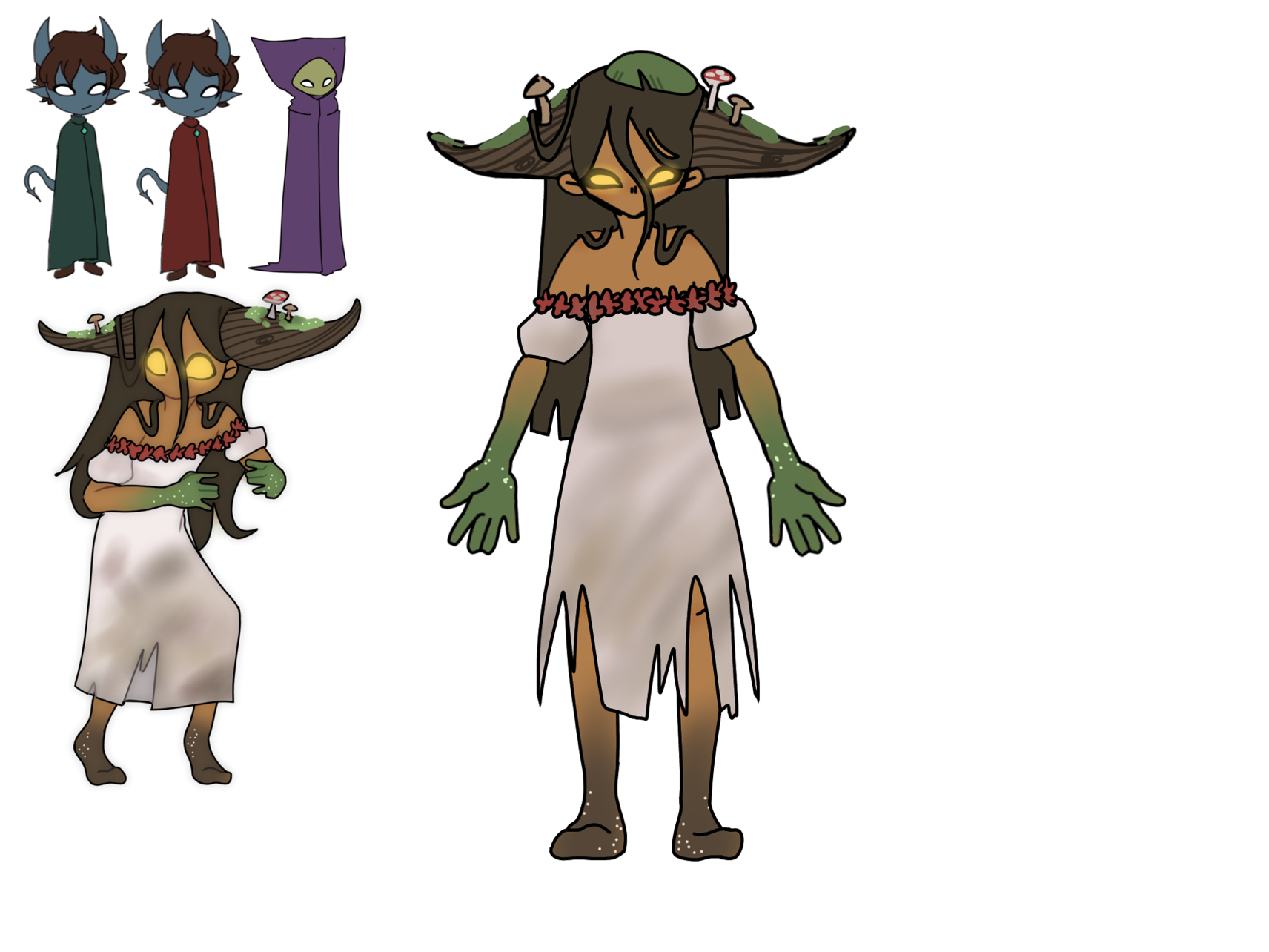
Figure 1.1.10, Full-Body Experiment 2
Overall, I still really liked the original,
except for the addition of a Lilypad on her
head (figure 1.1.10), and I decided to move
forward with finalising the design.
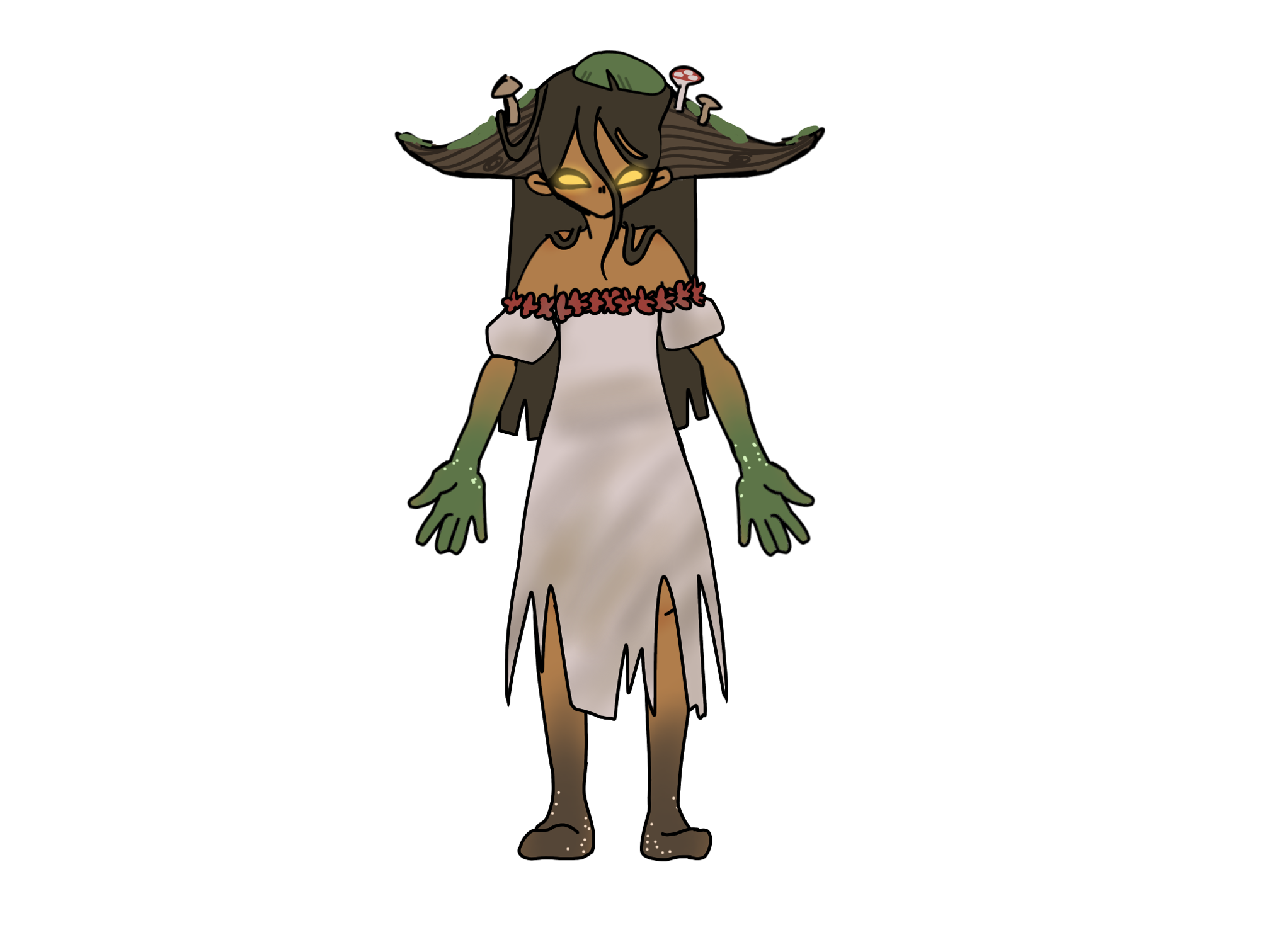
Figure 1.1.11, Finished Design
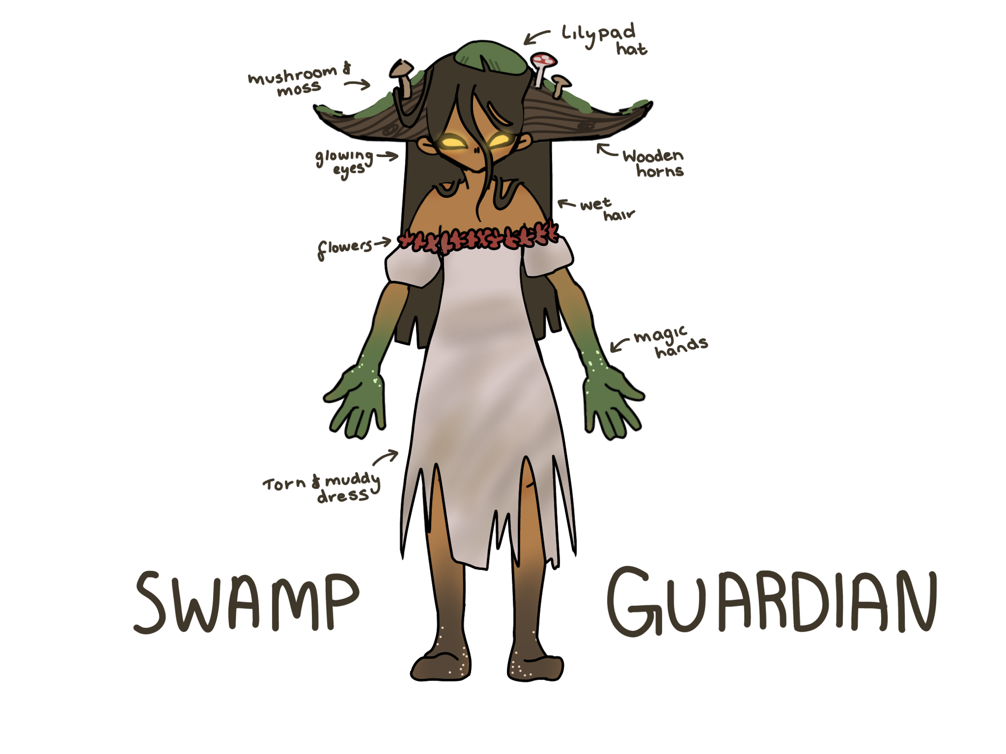
Figure 1.1.12, Finished Design - Anotated
With the characters now designed, we began to create
a plan for the gameplay, and even thing about possible
cutscenes. I drew up this illustration to help myself
visualise the ideas:
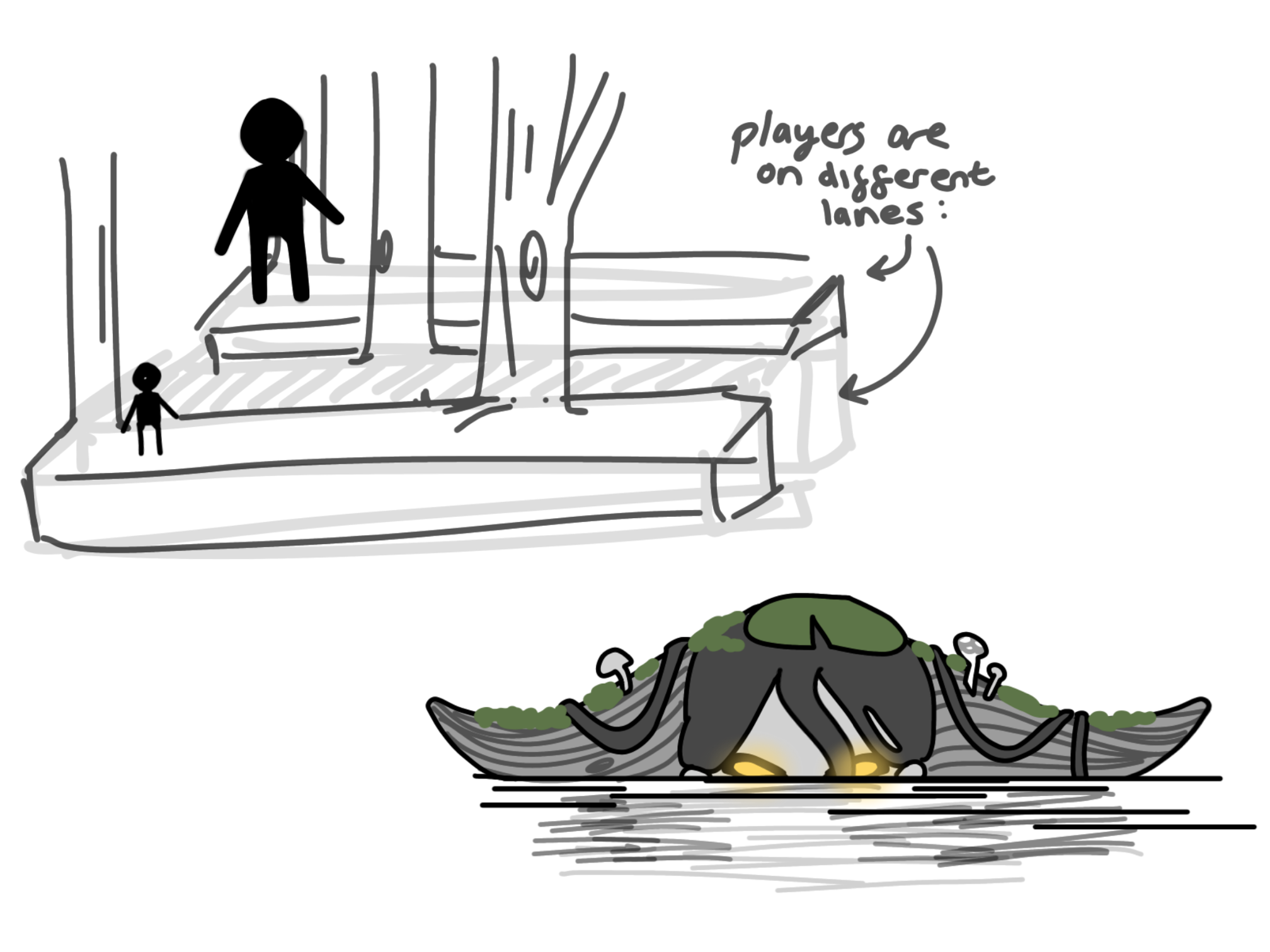
Figure 1.1.13, Gameplay Ideas
In this illustration, I started to think
about the layout of the play area, and how
the characters would be separated. I was
also thinking about the possibility of the
swamp guardian character begin in a completely
flooded lane, as I deliberately designed her
head to look like two logs floating in the water-
which would be a super cool character introduction.
From this illustration, Willow and I began to
think about how the players would help each
other, and it was becoming pretty clear that
the idea was flawed. We brainstormed and eventually
came up with a solution: rather than the players
being on different lanes on the z axis, they would
be on different lanes on the y axis. One above, and
one below. With this new idea, we returned to the
drawing board.
NEW IDEA 2.0
With our new idea, I created an illustration to show our ideas:
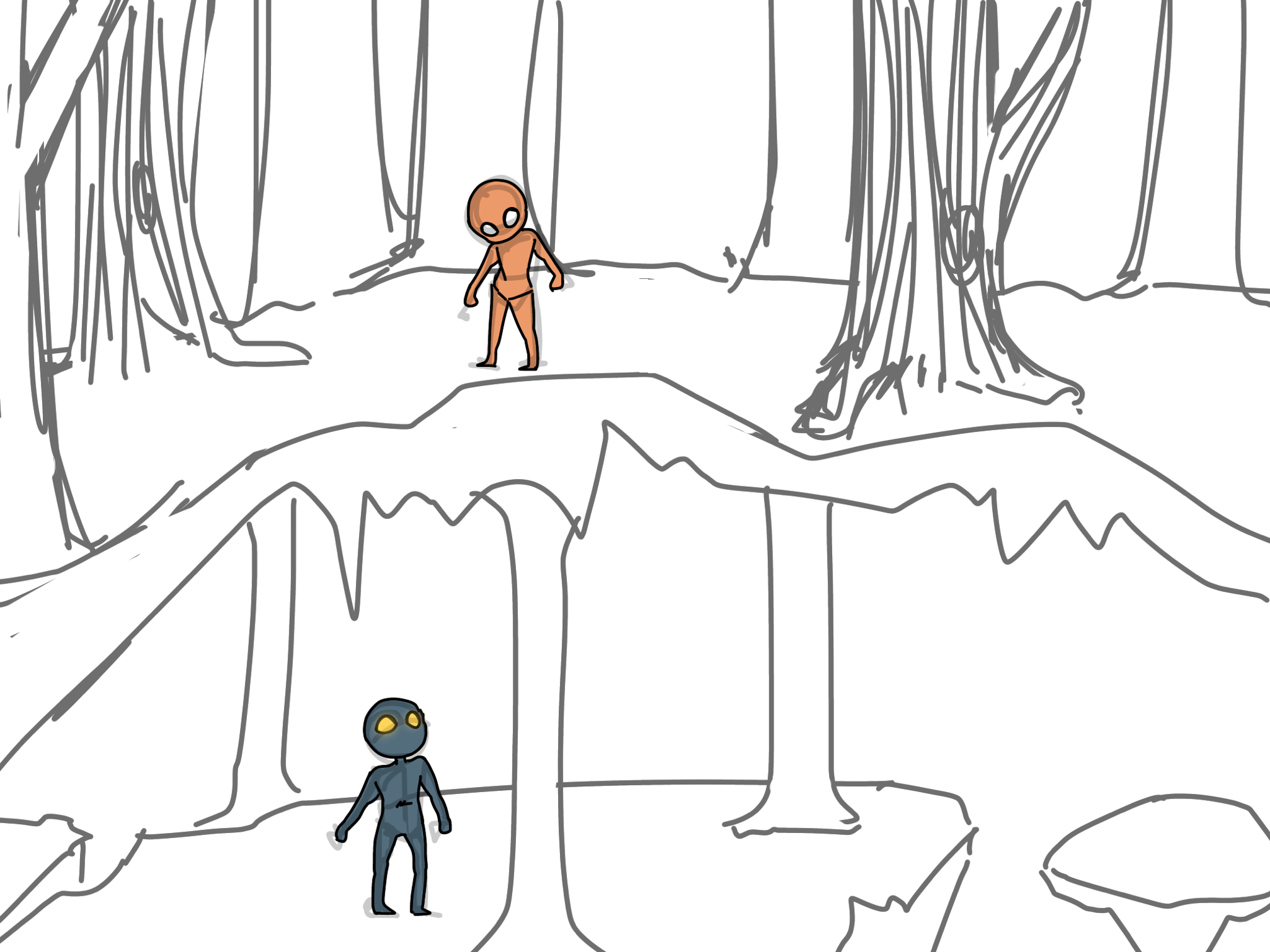
Figure 2.0.1, Concept Illustration 1
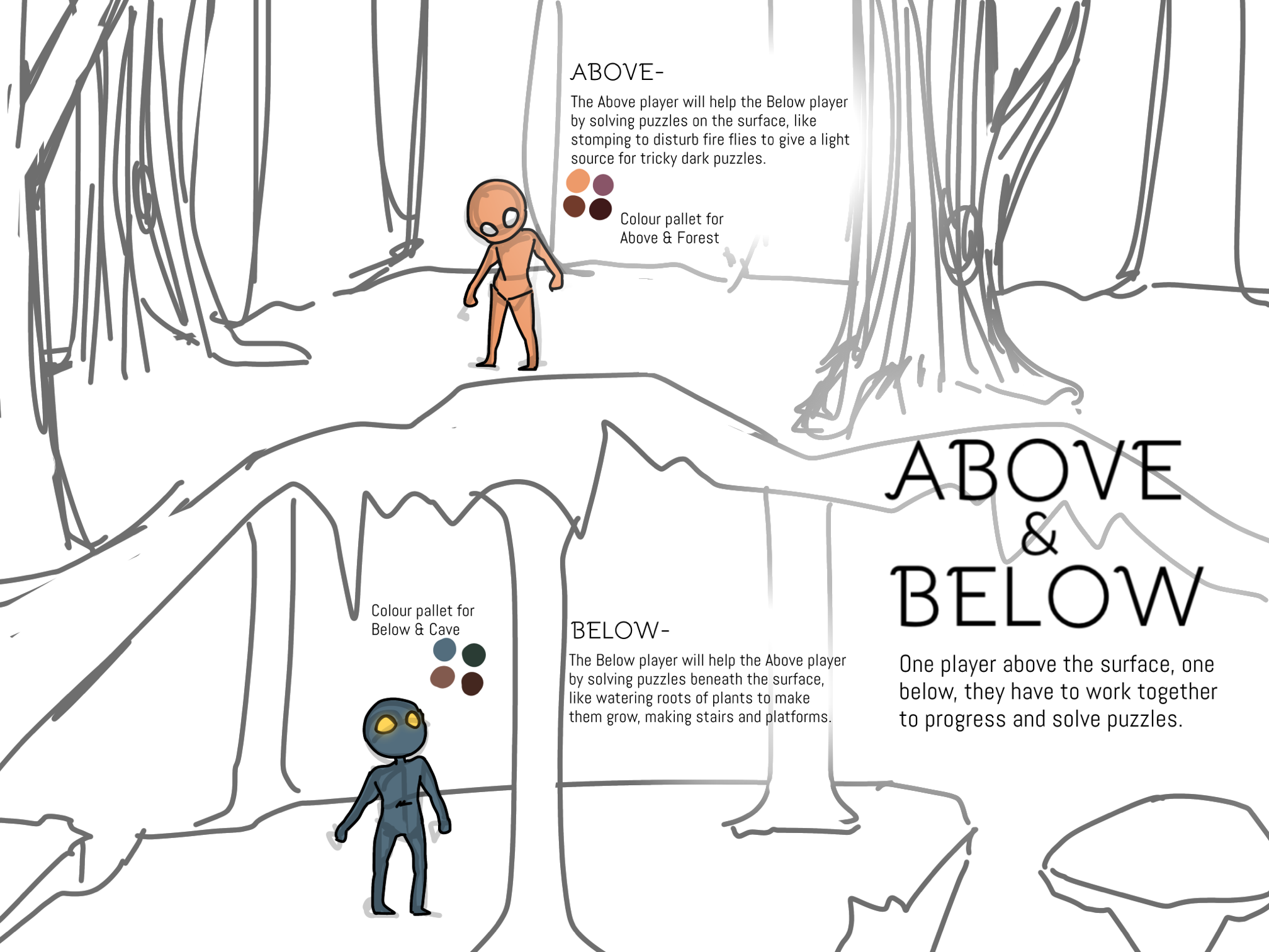
Figure 2.0.2, Concept Illustration 2
For our new idea, one player would be in a cave below
the surface, and one would be in a forest at ground level.
his was particularly interesting, as it gave us the chance
to experiment with different environments and colour pallets.
We decided to give the above ground an orange colour pallet,
and the below a blue colour pallet, to make them opposites on
the colour wheel.
We also realised that the characters would probably have
to be roughly the same size, in order for them to take
up the same amount of space on the screen fairly- so with
this, and the new colour pallet, in mind, I returned to the
drawing board.
CHARACTER REDESIGN 2.1
With the forest vs cave setting, we decided that Willow’s
blue Tiefling character was already fitting the colour pallet
for the ‘Below’ character, so we left him unchanged for the
meantime. It also made sense for him to be the cave-dweller,
as Tieflings (in the D&D lore) are mostly rejected and feared
by townsfolk, explaining why this character is under the floor.
For my character, I mostly experimented with humans or elves,
in order to keep the contrast between the characters:
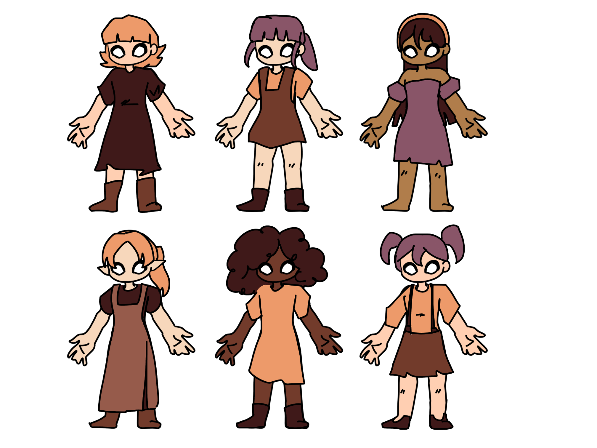
Figure 2.1.1, Designs 1
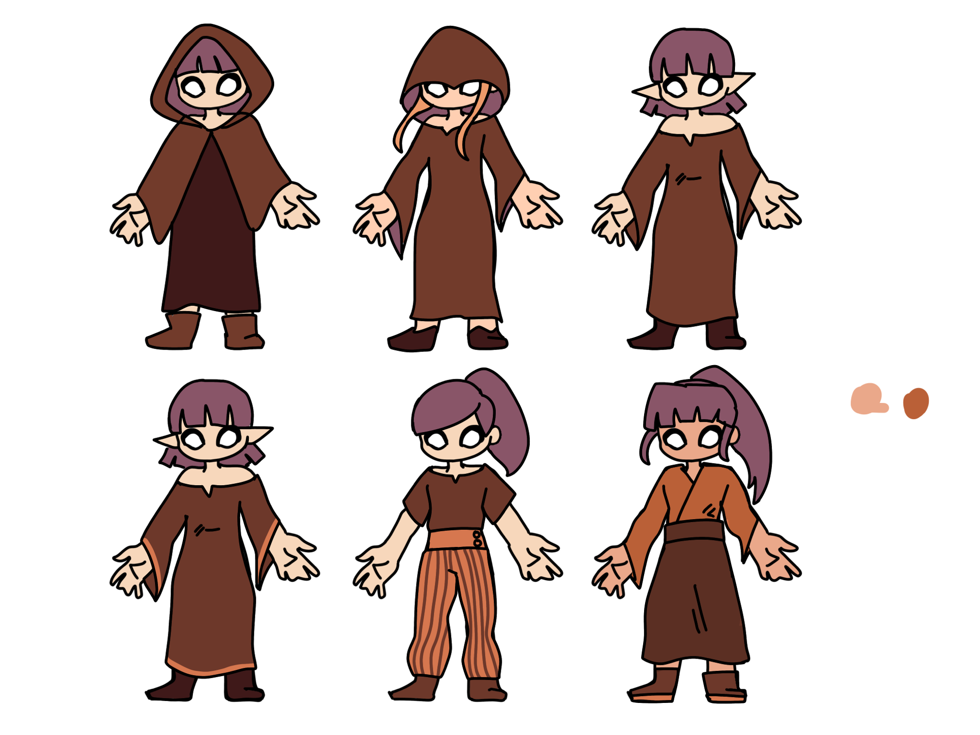
Figure 2.1.2, Designs 2
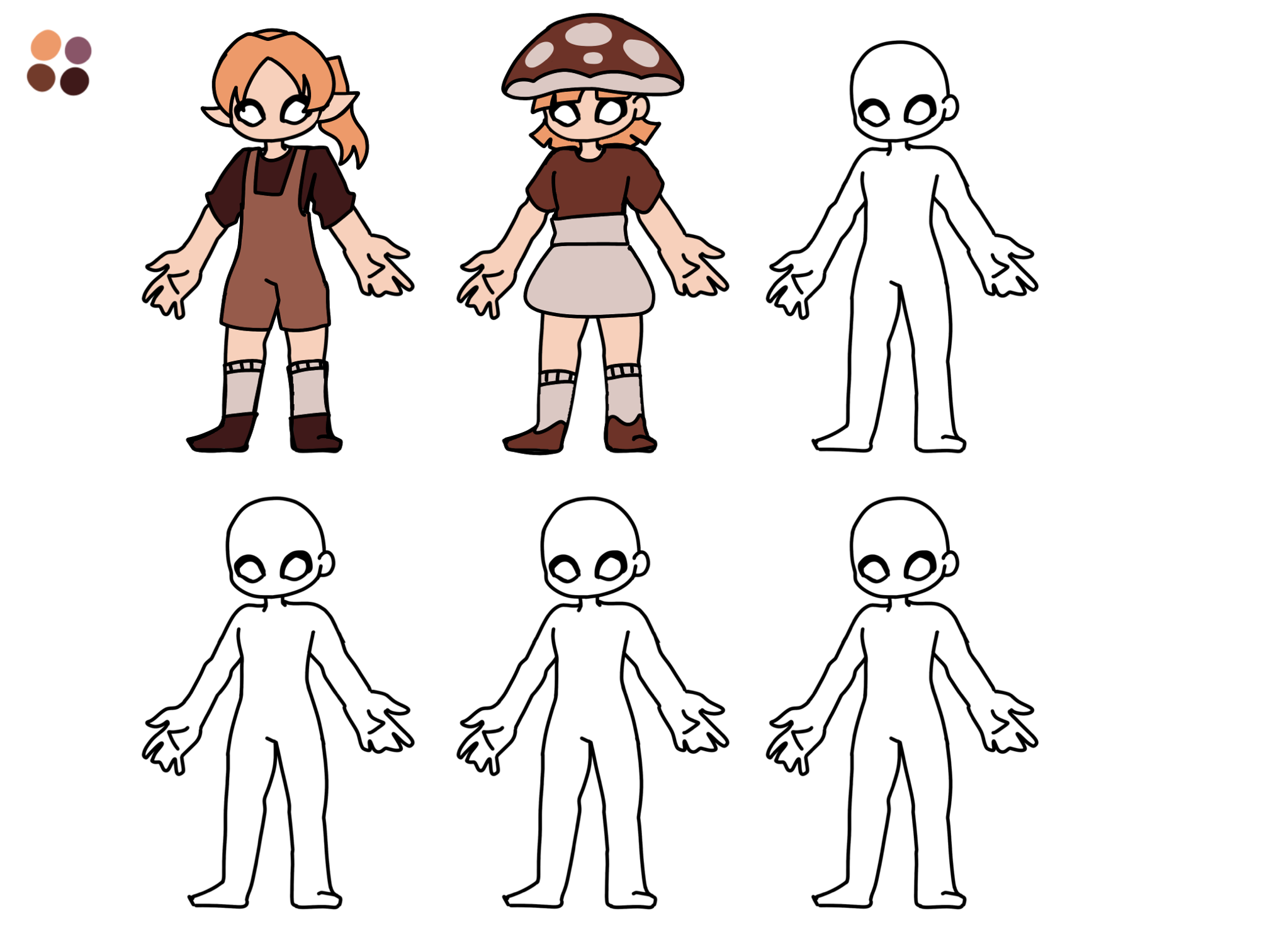
Figure 2.1.3, Designs 3
After a few pages, it became pretty apparent that none
of these designs were standing out. I wasn’t exactly
even sure what I disliked about them all, except that
they came across as boring and uninspired. Evaluating
the designs, I decided that the first thing I wanted to
change was the colour pallet, as I was using pretty
washed-out colours, and I hoped this would be a good
starting point.
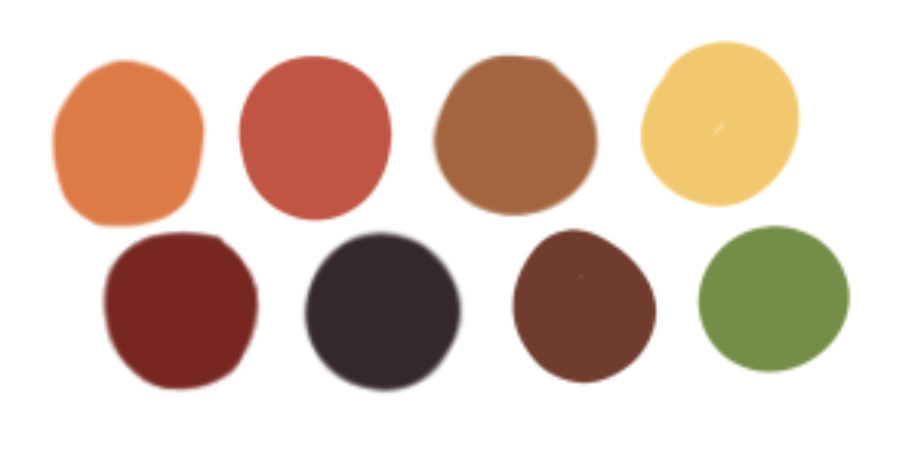
Figure 2.1.4, Colour Pallets
I created a colour pallet with more colours,
and with green and yellow as accent colours, as I was
previously missing accent colours and contrast from my
last designs. I also tried to pick colours that I would
easily be able to incorporate into the woodland setting,
such as the browns and burgundies.
Another helpful idea was that Willow and I began to brainstorm
what the character would do. We decided that she would wield a bow
and arrow. This would come in handy for puzzles, such as targets,
that we could incorporate into our puzzles; however, I also found
it very useful during the design process. Her weapon of choice gave
me a small look into this character: was she a hunter? What kind of
personality would a hunter have? Etc.
With all these thoughts in mind, I drew this design:
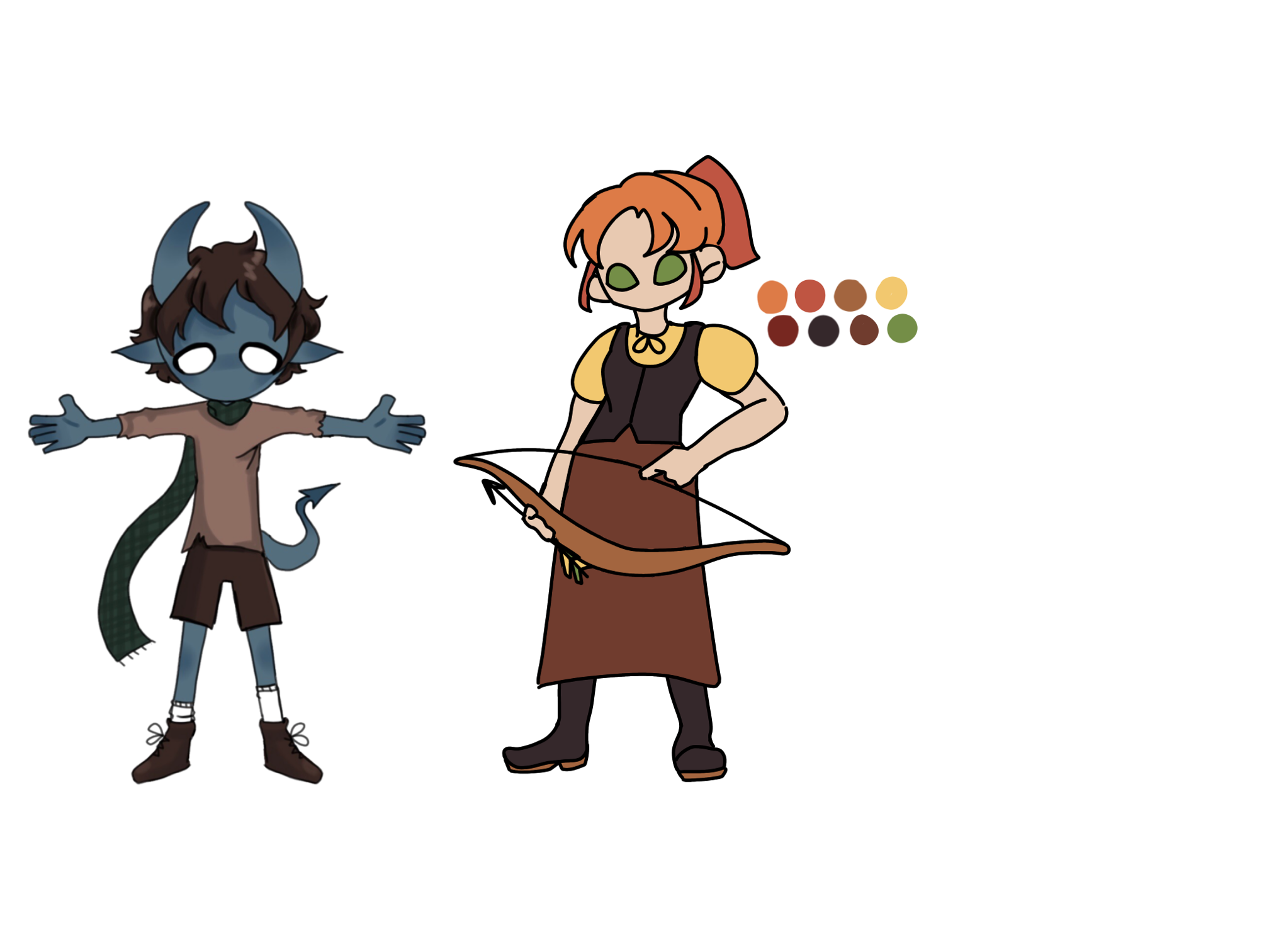
Figure 2.1.5, Initial Design
I actually really liked it initially, but the solid
eye colour was throwing me off- I didn’t work as
well for this hunter-girl as it had for swamp-guardian,
so I experimented with some small details:
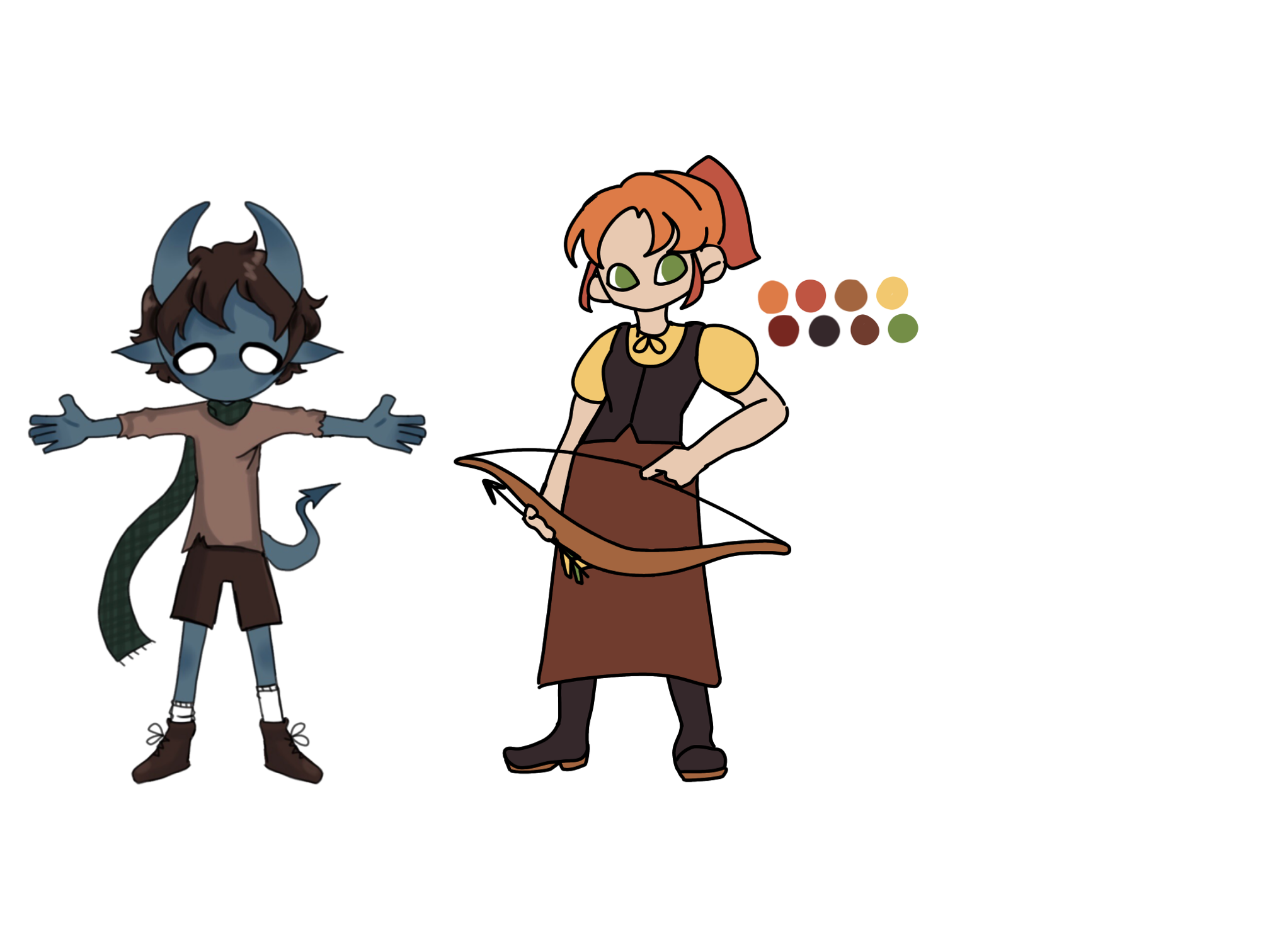
Figure 2.1.6, Updated Design 1

Figure 2.1.7, Updated Design 2
With the addition of some white to the eyes, and other
details, I thought she looked much better. I really liked
the colours, and the playfulness of the design, but I didn’t
want to stop here, I wanted to further experiment, so I created
three similar experiment designs:
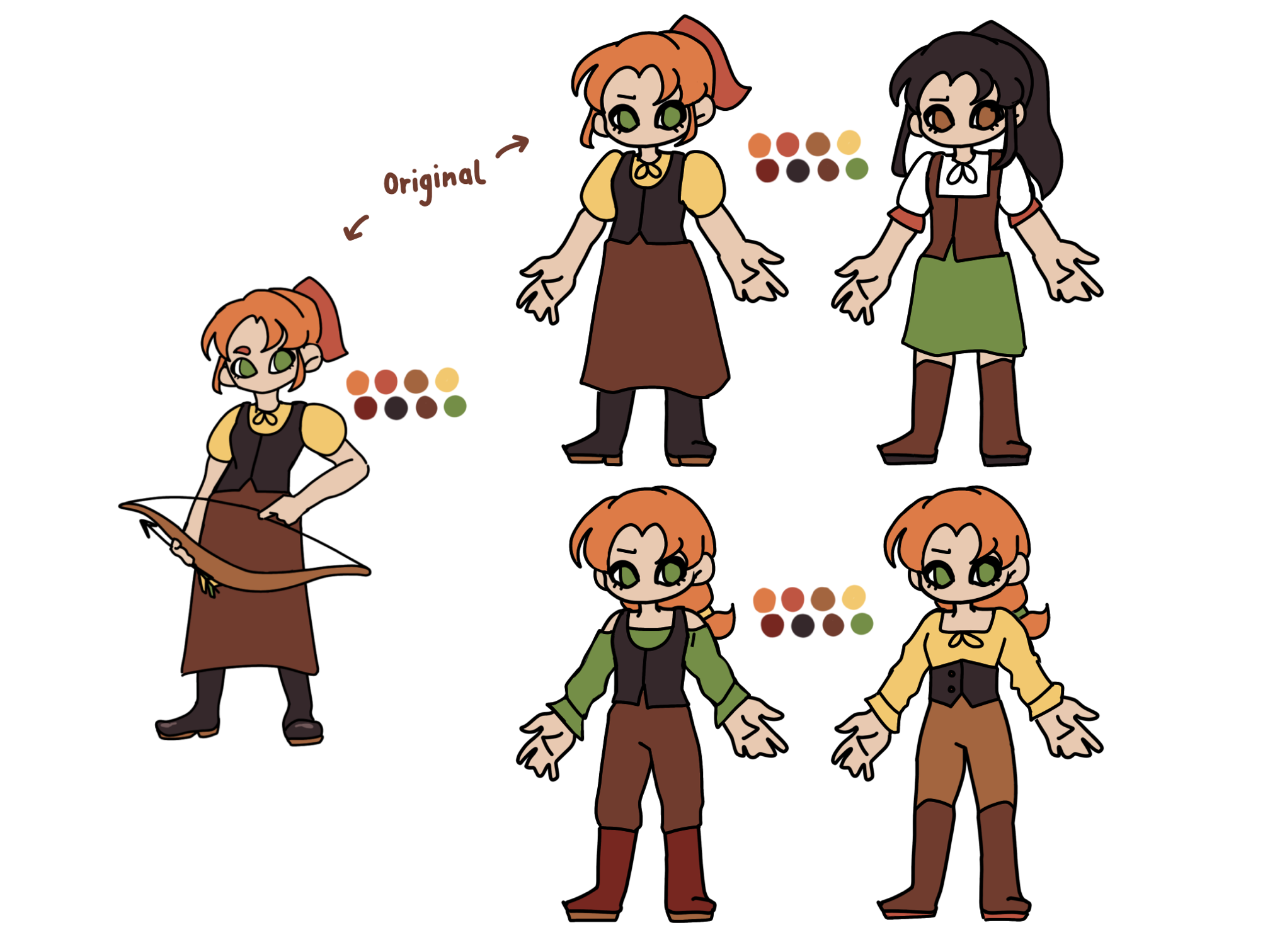
Figure 2.1.8, Design Experiments
I actually really liked all of these designs.
My least favourite was the one with the dark
hair, but other than that, I could have picked
any of them moving forward. I ended up opting
for the bottom-right design, and created another
page of altered experiments, this time focusing
on colour:
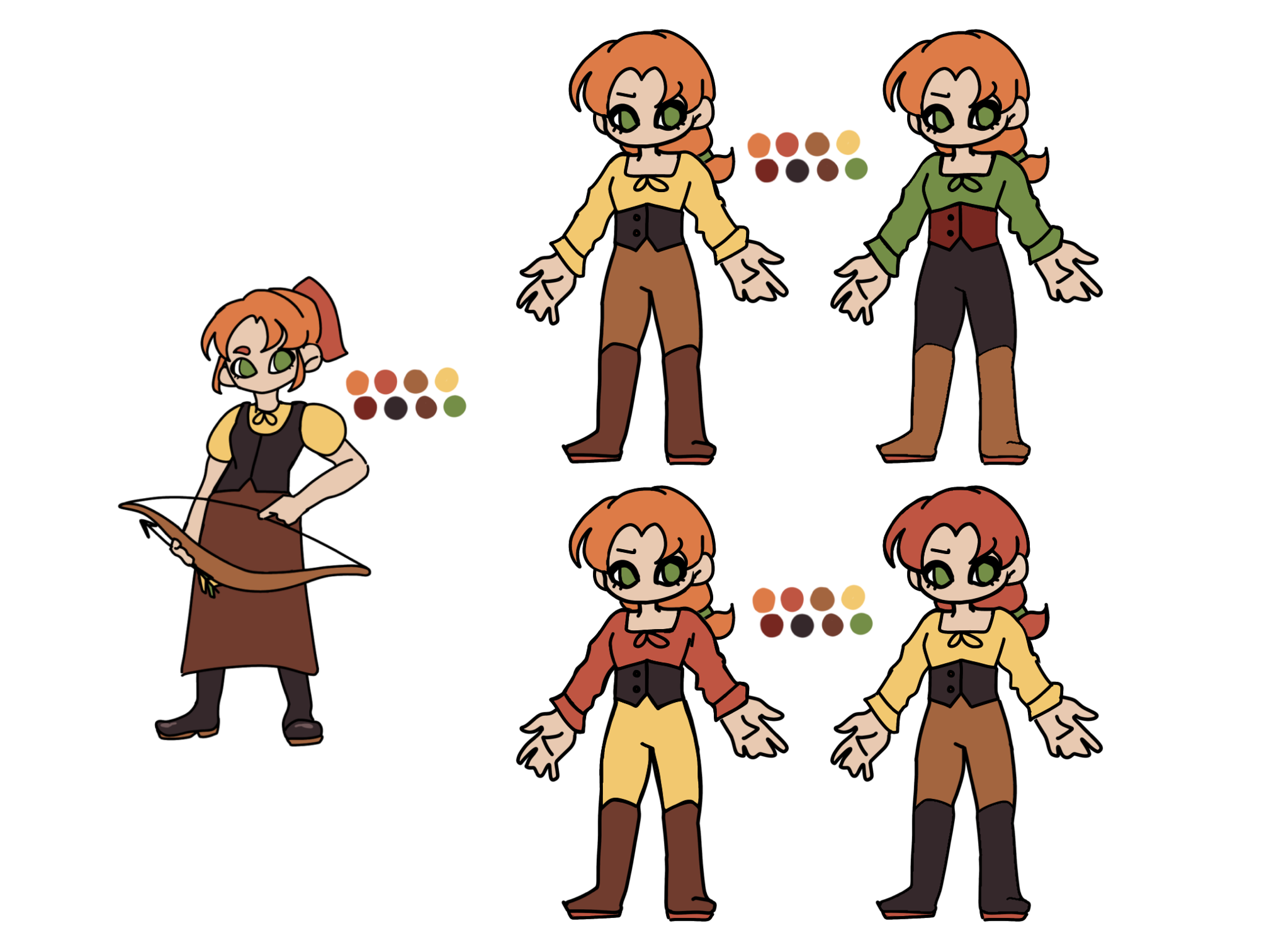
Figure 2.1.9, Further Design Experiments
Overall, I liked them all; however, I felt that the original
top-left design was still my favourite. I liked the contrast
of the waistcoat/corset thing compared to the lighter colours
of the t shirt and trousers, and the original hair colour was
still my favourite. I also liked how green was minimised and
only used as an accent colour, just appearing in the eyes and
hairband. The only colour I had failed to include from my colour
pallet was the lighter burgundy red, so I decided to make her bow
and arrow this colour.
With the character design complete, I created a front
and back reference of the character, which I knew would
come in handy later when I will be creating the model.
In this final reference, I made sure to simplify the
design slightly, as it was beginning to dawn on me how
ittle I knew about blender. Overall, I actually think
the simplification helped with this design, as it made
it more distinctly a unique style.
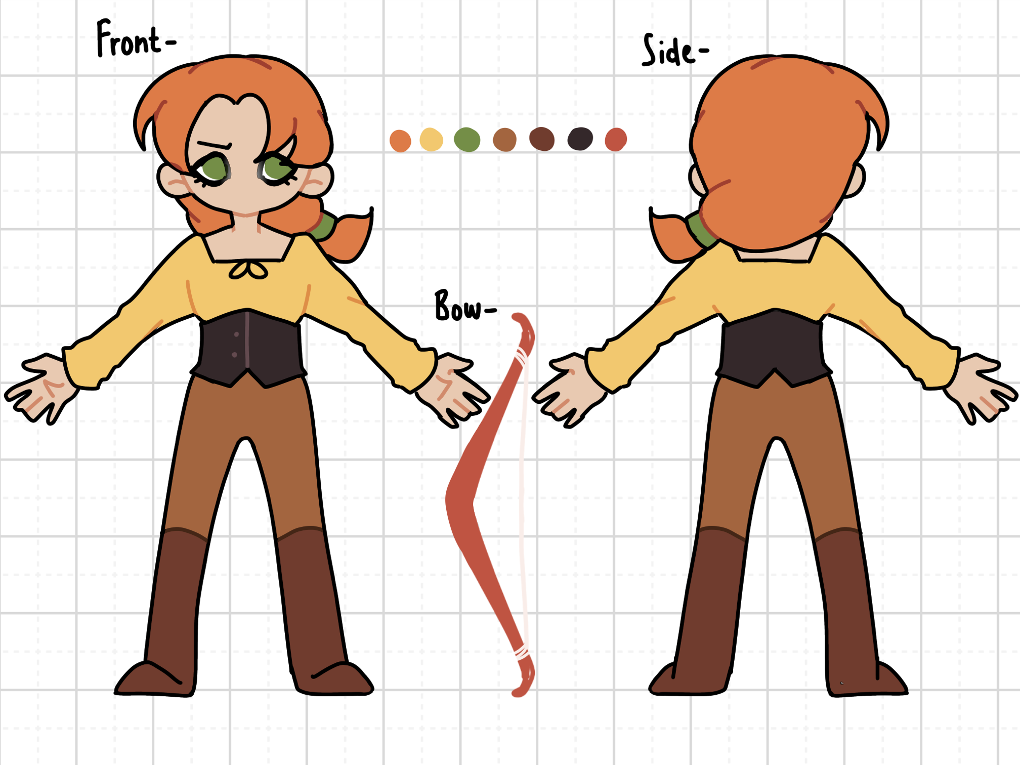
Figure 2.1.10, Model reference
MOVING FORWARDS 3.0
With the project in early development, Willow and
I are going to focus a lot of our time over the summer
into trying to get a working protype. This will include
modelling, rigging, and creating animations for our
characters, as well as building a working prototype on
Unreal Engine. I will upload more progress as I go, to
both this project page, and the ‘Learning Blender’ and
‘learning Unreal’ pages.