OFT
Redesigning and Rebranding.
INTRODUCTION 1.0
Back when I was in college, I was set a very
opened ended project, where I could create
anything I wanted for my Graphic Design A-Level.
This project was especially great for two reasons:
the first being that I was allowed to work
collaboratively with my twin, and the second
being that I was allowed to create concept art-
which I had, and still have, a huge passion for.
Willow and I began to plan a game, and create character
designs and a narrative, but we realised that we didn’t
have a game company logo. For the project, I created out
game company logo, and Willow created the logo for the
game itself.
BRANDING 1.1
We went through a few ideas for a company name,
eventually deciding on ‘Two For One’, this was
because our company would specialise on two player,
local co-op games. As twins who both enjoy gaming,
we have noticed the recent decline in these types
of games, with mostly single-player campaigns, or
online co-op being preferred by companies. With our
identity and title established, I began to sketch
out ideas:
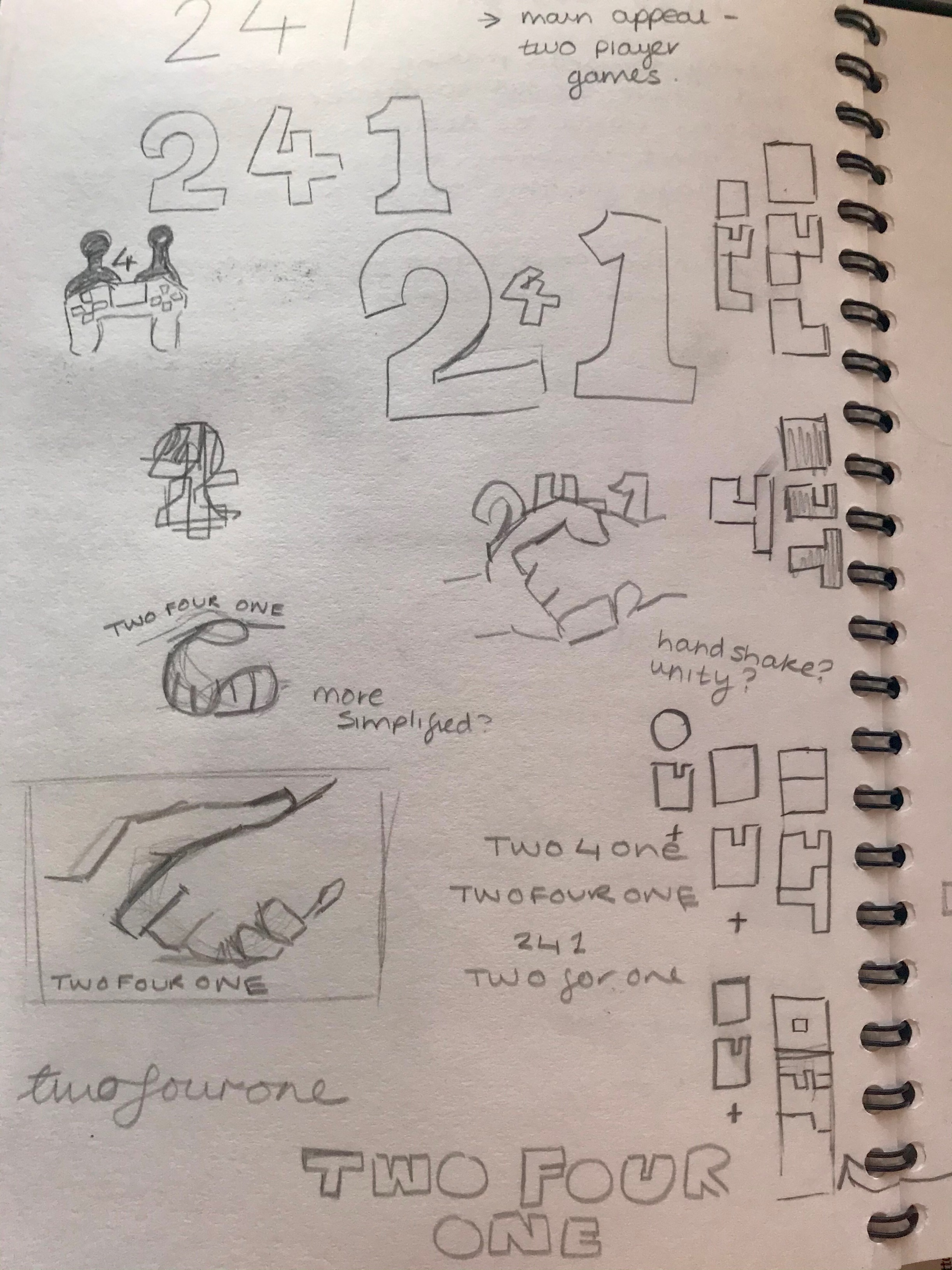
Figure 1.1.1, Initial Sketches 1
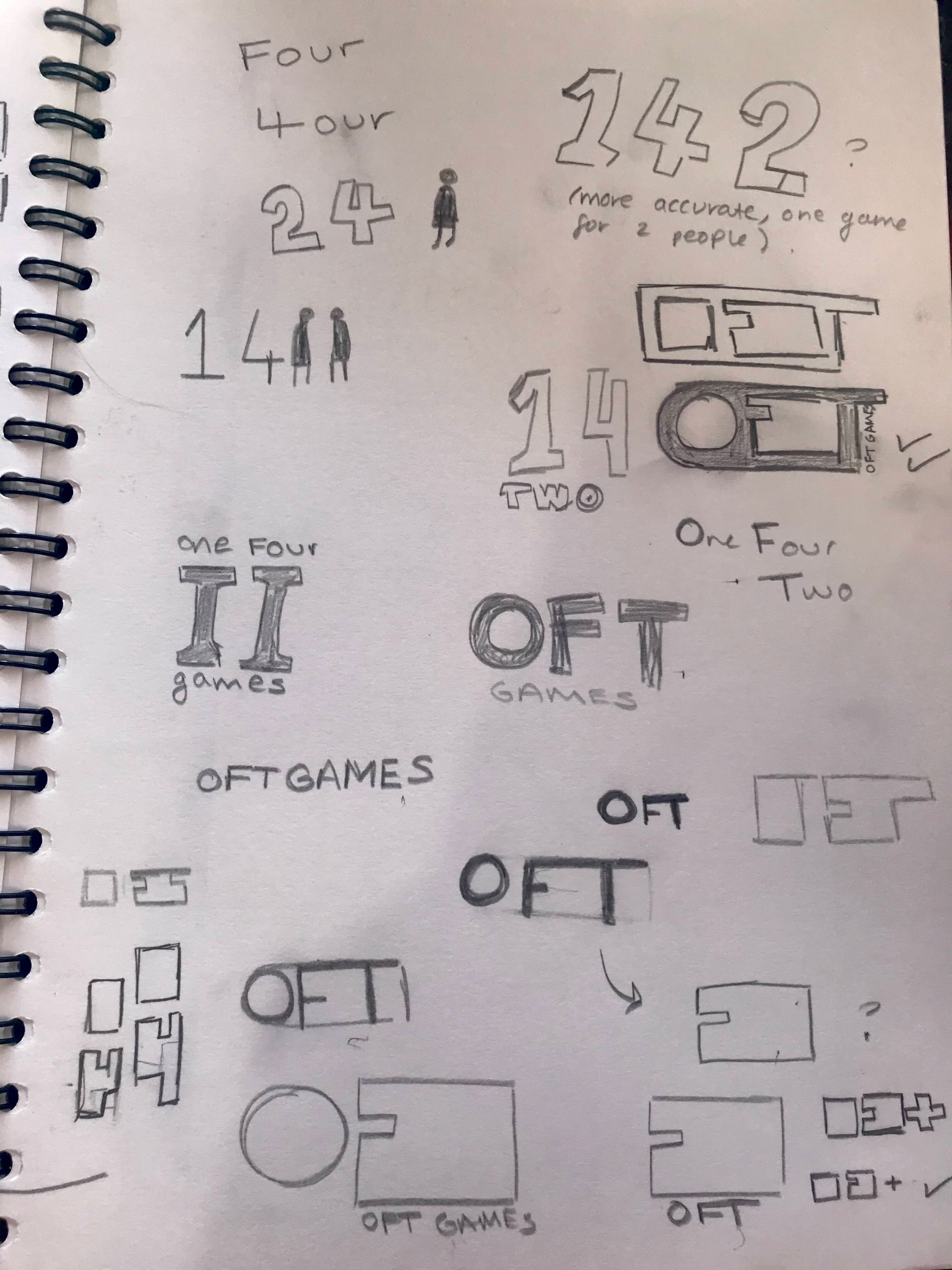
Figure 1.1.2, Initial Sketches 2
From these initial sketches, I had absolutely no idea how to start
designing a game company logo but was trying to focus on the aspect
of togetherness that people get from two-player games. I also ended
up deciding to change the game of the company to ‘One For Two’ instead,
as we would be producing one game, for two people. This sparked some
more ideas, and I began to notice interesting shapes in the letter ‘OFT’.
I experimented with negative space, and drew multiple iterations.
Eventually, I reached the stage where I was ready to work
digitally, and I created these designs:
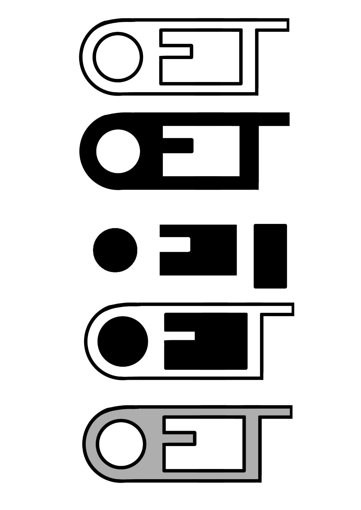
Figure 1.1.3, Digital Development
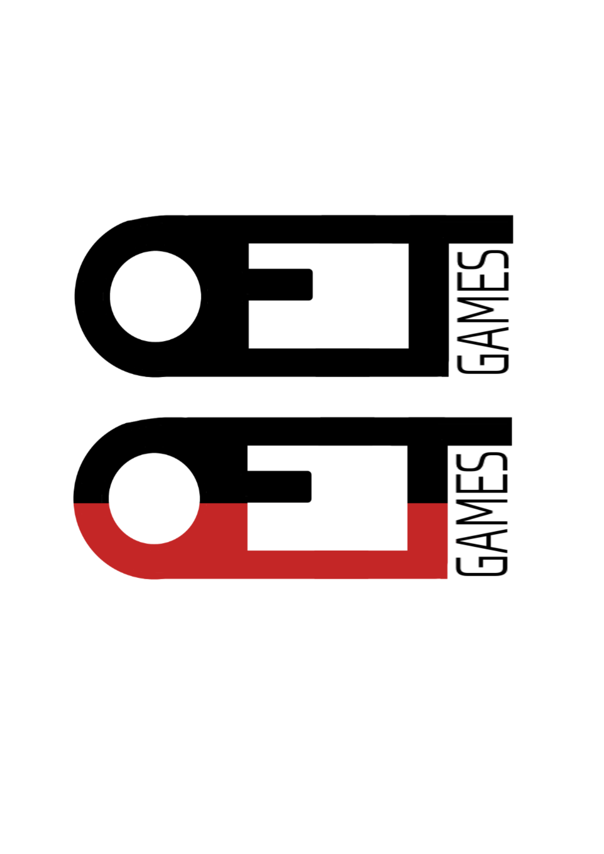
Figure 1.1.4, Final Design
With that, our logo for this project was
complete, and I used it on all of the posters
and game-covers that I made for the projects.
REDESIGN 2.0
A few years later, Willow and I have decided to
create an indie game over the summer. It’s two-player
(naturally), so we decided to bring back OFT.
The previous logo was about two years old, and
I felt it looked dated and unappealing. From what
I have learned over the course of my Graphic Design
A-Level, and from the lecturers at university, I
decided to create a new logo- building off and
improving my previous ideas. I still liked the
name and identity from OFT, so I went from there:
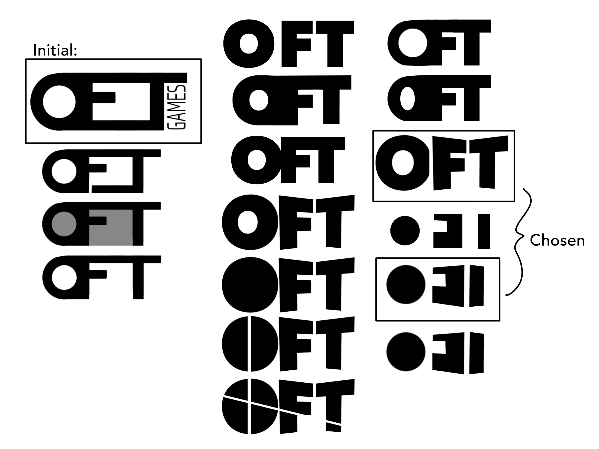
Figure 2.0.1, New designs: first pass
I kept the original logo in mind and made a
few iterations using this as a base. My main
issue with the previous logo was that it appeared
to say OET rather than OFT, so I tried to combat
this first. If I remember rightly -it was a while
ago- I didn’t actually use a font for the original
logo, I just created it myself out of shapes. This
time, I chose a large, bold font and went from there.
I made any iterations, trying to focus some of them
on the negative space, and the shapes that I had found
so interesting at the beginning. Out of these initial
few, Willow and I discussed, and chose our favourites.
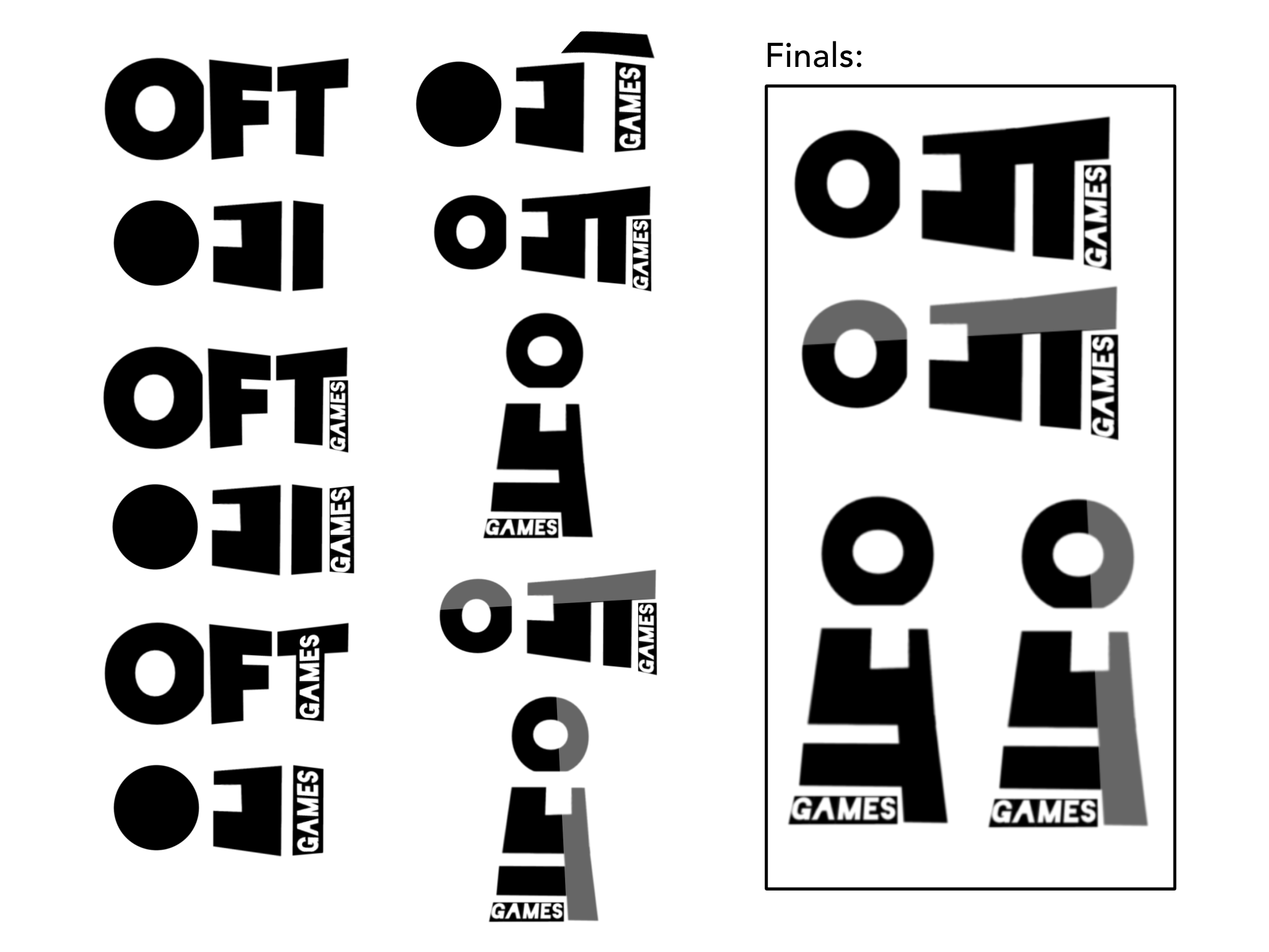
Figure 2.0.2, New designs: second pass
On the next page, I kept working with elements
that we had liked from the previous two, keeping
them on the page for reference. I created a few
more designs, until I ended up with one that I
thought was really interesting: I really liked
the shape, and how it looked a bit like a speakerphone
when landscape, and a lighthouse when portrait. At the
time, I thought these would be final, and made a few
iterations. One of my lecturers says that a good logo
should be distinguishable in just greyscale, so I
experimented with a stripe of colour -similar to the
original design- and decided to explore a colour pallet
at a later date.
After a few weeks of working on other projects, I
returned to OFT. As cool as the shape was, I felt
that the logo had become illegible, and that I should
return my focus to readability. With this, I created
another pass of logos:
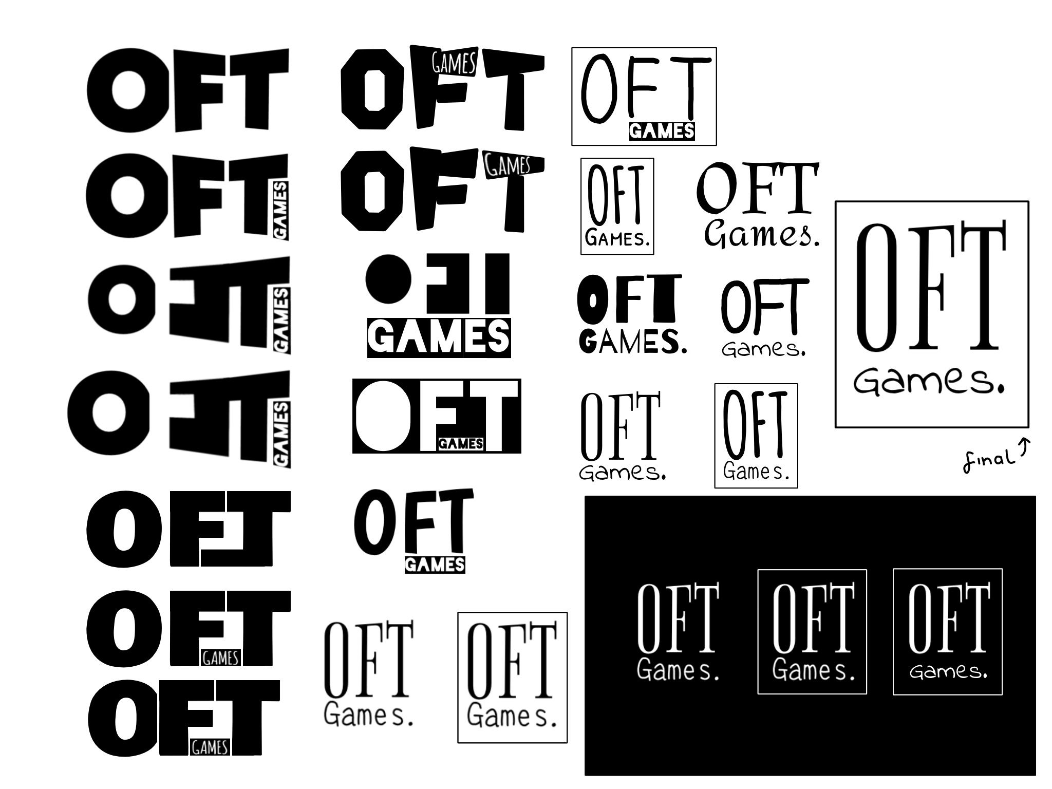
Figure 2.0.3, More Experiments
I returned to the drawing board, keeping some of my
favourite logos as inspiration on the left side. I
tried to make the previous favourite logo more legible
by sizing up the ‘O’ and moving it further away, but
I still didn’t think it was enough. I began to
experiment with a different font and kept focusing
on how to make the shape between the ‘F’ and the ‘T’
visible, without transforming the ‘F’ into an ‘E’ shape.
After a few designs, I noticed that the logo
was looking a little stiff. For an indie-game
company run by two people, I didn’t want the
logo to end up looking too corporate: this was
fine when I was creating my college project, as
it was hypothetical, and mostly mock-ups, but for
actually creating games, I wanted it to look more
friendly. I did a few more logos, and then consulted
Willow for feedback.
We both liked the bottom one in the second column,
so I created a new column of logos similar. We also
decided to try the logo on a black background, as
that’s probably how it would appear at the beginning
of a game before the title. On the black, I was a
little worried that it looked like a perfume, or
whisky brand, but I thought the one on the end with
the more playful ‘Games.’ font countered this pretty
well. And with that, we had developed the new OFT logo.
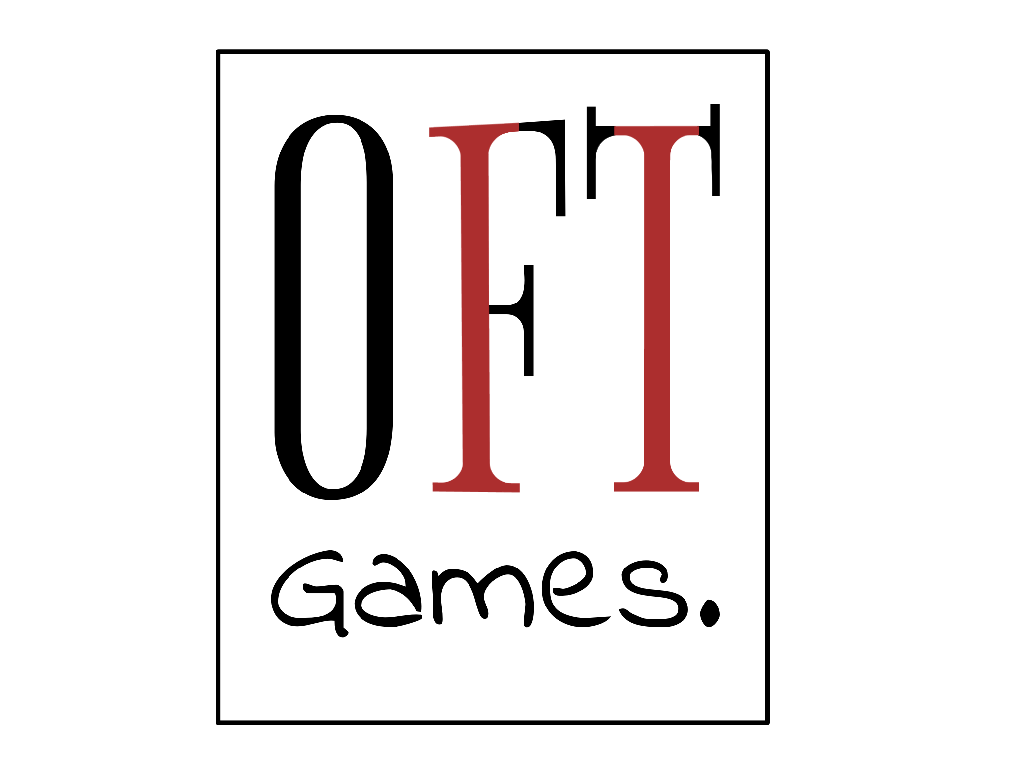
Figure 2.0.4, Final Experiment
Before fully committing, I tried one last experiment.
Seeing as the games were all going to be two-player,
I tried to fit the roman numerals for ‘2’ into the logo.
I was able to pull this off, but I thought the blank logo
just looked more appealing. And with this, I created a
final version of our logo:
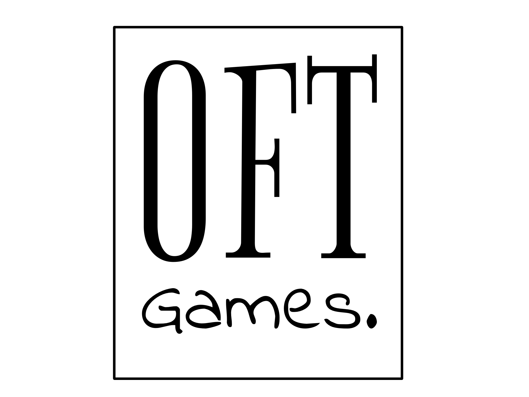
Figure 2.0.5, Final Logo
These are the fonts used to create the logo:
Figure 2.0.6, Font Credit
CONCLUSION 3.0
Overall, I really like the finished design.
I think it looks like an indie game company,
and definitely looks a lot more friendly than
the original. I was a little sad about abandoning
the cool shape between ‘FT’; however, I think the
logo definitely benefited from it.