Our second group project at Winchester University was the mobile game project.
My last project didn’t go very well, so I was a bit sceptical going into this
new one. Despite this, it became obvious to me during our first group discussion
that this group was going to be a lot more compatible. The first thing we discussed
as a group was finding some common ground in our interests; many members of the
group were very dedicated to making sure this project could be something we could
all excel in, as well as enjoy throughout. Upon discussing potential ideas for video
game and console genres that interested us, we concluded on vr horror games. Many
of us were also interested in particularly the zombie-horror genre, so we used
this for our starting point.
PLANNING DEVICE 1.1
We were challenged with creating a unique mobile device, so we began to
brainstorm ideas to make a vr headset more unique. I thought of an idea
to have the vr headset use more than the two regular senses, visual and
auditory, and to have the game actively react to the presence and pressure
of breathing. This would work well with a horror vr game, as games like
this already cause the user to often hold their breath in anticipation.
In our game, the player would have to stealth around a post-apocalyptic
environment, holding their breath in certain sections to avoid detection.
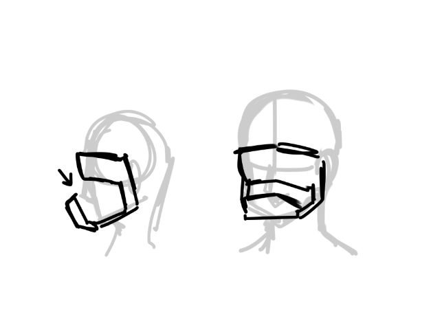
This was my first sketch to convey the idea of a chamber to detect the
breathing:
Figure 1.1.1, Initial Sketch
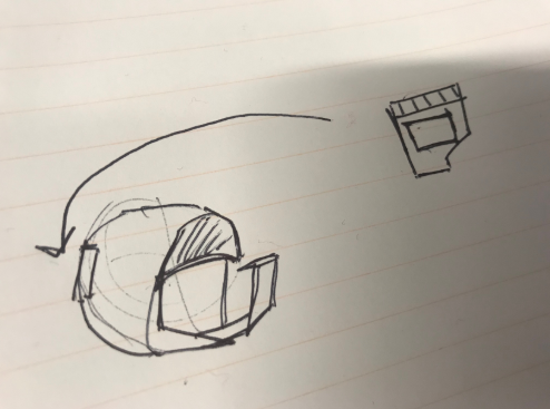
Upon further development and later discussions, we decided to
have our headset be completely portable to better fit the ‘mobile’
aspect of the game project brief. The idea was to have small
cartridges, similar to the DS or Nintendo Switch, that would
insert into a section in the back of helmet.
Figure 1.1.2, Sketch
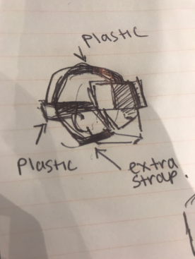
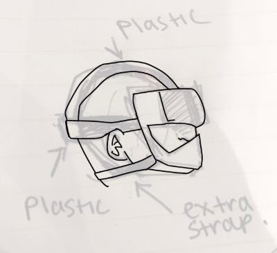
After discussing this sketch with my group, we decided
it looked slightly too claustrophobic, and we didn’t
want to cause any discomfort or stress from our users,
so we tried to rework the design. Upon looking at pictures
of other mobile vr headsets, like the oculus, and decided
to opt for a mixture of straps, Velcro, and plastic sections,
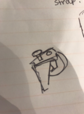
similar to the PlayStation vr. Here are the sketches I
created during our brainstorm:
Figure 1.1.2, Discussion Sketch- headset
Figure 1.1.2, Discussion Sketch- handheld
Figure 1.1.2, Refinded Sketch
PLANNING GAMEPLAY 1.2
Once we all had a basic idea of the functionality
of the device, I began to focus on the game. In our
brief, we were encouraged to include hints of the
Sustainability Goals 2 – End hunger, achieve food
security and improved nutrition and promote sustainable
agriculture- and 11 – Make cities and human settlements
inclusive, safe, resilient and sustainable. We thought
that these aspects could be very effectively woven into
the story and narrative of a zombie apocalypse game,
and to this capacity, they would not dominate our project,
but would still be at the core.
For this project, we also decided to appeal to a
target audience of teens, as they are a main consumer
of indie horror games, such as Five Nights at Freddy’s,
and Poppy’s Playground.
We began to brainstorm a story with these elements,
and a gameplay style for our game. Upon much collaboration,
we ended up with this pitch:
“ The player embodies a farmer in a post-apocalyptic world,
who cultivates crops. This character also takes some of their
crops to trade with other settlements, in exchange for building
supplies to help fortify their farm and make it safer. Taking
the same perilous path each time, the game will show the same
journey at multiple different points in time, showcasing the
changing world of the apocalypse, with enemies mutating and
evolving with each level. ”
In our idea for the game play, it would be similar to another
game favoured by our target audience, Five Nights at Freddy’s.
Each level would take place in the same location, with the main
change being the date at the beginning – e.g ‘night 1’ – and the
difficulty of the level. Our game, however, aimed to push this
formula with the inclusion of enemies varying from level to level.
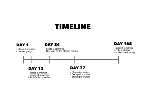
With this concept in mind, I created this timeline:
Figure 1.2.1, timeline
Each Day is a different level, with our game having
five levels in total. With the delivery aspect to our
game, a key inspiration was Death Stranding, although
tonally we tried to avoid the wacky and unpredictable
feel of the game. For tonal inspiration, we leaned more
in towards the likes of Resident evil: specifically
Resident Evil 2 Remake, and Resident Evil Biohazard.
We were aware that these games were 18 rated though,
so we knew that we would have to tone down the horror
aspect from these inspirations. To combat this, we
opted for a semi-realistic style, similar to the likes
of TellTale games, specifically ‘TellTale’s The Walking
Dead, A New Frontier’. With all of this in mind, I began
to create concept art of the enemies to be shown in our
group pitch presentation.
CONCEPT ART 1.3
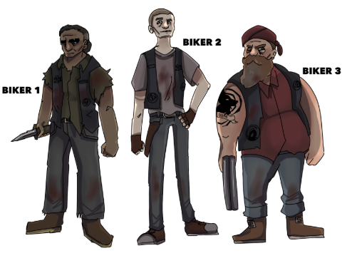
Figure 1.3.1, Day 1 Enemies
Here I designed the first group of enemies: the bikers.
I tried to make them look varied, but also menacing-
leaning into many villainous biker stereotypes found
in the media. I feel that each one looks intimidating
in their own way: especially the middle one, Biker 2,
who is the only one I drew without a weapon drawn and
ready. I like how I was able to capture an odd arrogance
to him, by his unbothered and slightly unhinged demeanour,
with his head held high and a hands-on-hips pose: he looks
to be the leader of the gang. The others look more like
the ‘muscle’, which I feel makes him the most frightening
in a unique way.
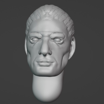
For this project I would be using Unreal Engine, a
program I had absolutely no experience in, making this
project a huge learning curve for me. I decided to push
myself further and learn the basics of another new program,
Blender. Following a YouTube tutorial, I tried to recreate
the face of Biker 1:
Figure 1.3.2, Biker 1 Model
Overall, for my first Blender model, I
don’t think its half bad. I don’t like his cheekbones,
I think they’re too exaggerated, and his lips look
quite strangely, and unnaturally pouty, as though
his has lip-filler, but overall, it’s decent for
a first try.
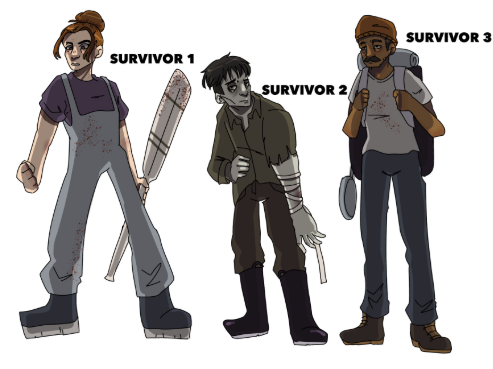
Next, I created concept art for the second wave of enemies:
Figure 1.3.3, Day 13 Enemies
My favourite part of video game design or development
is definitely concept art, specifically character design.
I really enjoyed coming up with these designs, and especially
trying to capture the more desperate, untrusting, and
nihilistic look of a group of Day 13 survivors. One of
the survivors is clearly ‘bitten’ and appears very zombie-like
already with his slumped posture, greyed skin, and yellowed
eyes, while the others look angry, desperate, and detached.
With these being the last bunch of humans to design before
the first wave of zombies, I tried to make them look quite
near the end of their journey: clearly an infected in the
group will greatly decrease their likelihood of survival.
Out of all the designs I did, my favourite is Survivor 2,
simply because of how similar he looks to a zombie: it was
very fun and interesting to draw.
Another member of the group oversaw creating the designs
for the infected, which he did as headshot 3D models. The
infected started out as regular zombies on Day 34, and
gradually mutated until Day 165 where they had large
mouths taking up most of their head, a lack of eyes, and
their teeth had grown mush sharper.
We had also decided on a name for the game by this point.
We struggled a lot to find a name that seemed to fit the
delivery aspect, as well as the zombie-horror, and brainstormed
a few ideas, until it hit me that the perfect, and slightly
humorous, name would be ‘Post-Apocalypse’, due to the nature
of delivery in an apocalyptic world. We also decided on a name
for the headset: due to its breathing related sensors, we called
it ‘X-Hale’, which we thought sounded pretty cool, and very
fitting of a game device.
Finally, before the pitch I began to train an AI as a
proof of concept for our breathing technique. I sampled
five different sounds for the AI to recognise: Background
Noise, Breathing, Heavy Breathing, Holding Breath, and
Direct Speech. I got samples from members of my group
for each to get a range of samples, and you can find
it yourself by clicking here.
With everything ready, it was time for the pitch,
where we showed our current progress to our lecturers
and peers in a presentation.
PITCH 2.0
For our pitch, we all showed our current progress,
and the lecturers liked our idea and work. Their
only issue was how ambitious it was, but congratulated
us for pitching something so big, and claimed that if
all our portfolio work was as good as what we had shown,
then it would be perfectly fine. I definitely took
this as a win, as it was much more successful than
any of the presentations in my last project, and I
felt that mostly everyone was contributing their
best work. There were a few members who did not,
one had a broken laptop, which was completely out
of her control, but unfortunately, one member
contributed nothing, and not once messaged or
interacted with our group chat for project discussions,
choosing to ghost us instead. Considering it was only
one member this time, I did not let it effect my outlook
on the project.
For this pitch, I also created illustrations
which I compiled into a video, showing a mock-up
of the breathing system:
Figure 2.0.1 Mock-Up Video
With the presentation under my belt, I began to work on the
game itself, and try to learn Unreal Engine.
GAME DEVELOPMENT 3.0
As I was a completely new user of
unreal engine, I decided to consult a
YouTube tutorial to help with the game’s
progress. This game had many complicated
elements, so I knew I’d have to use multiple
different tutorials.
The first tutorial I used was this
one, which was teaching the viewer to create
a 1st person survival horror game. This was slightly
different from what we had originally planned, but I
figured that I could convert it into vr later in the
project, and that it would be a good idea to start
with 1st person.
The tutorial had many elements that I did not need, like
a hunger system, but the tip I found most useful was
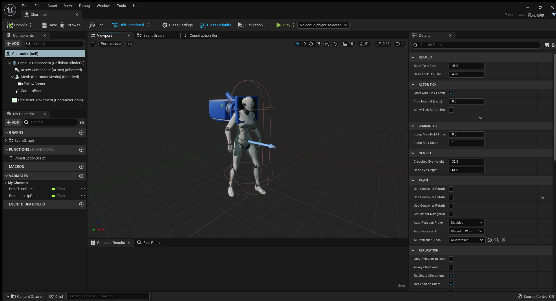
about the perspective. When you load up Unreal, you can
create a game that already has a 1st person view; however,
this tutorial recommended starting a 3rd person level, and
attaching the camera to the model’s head. This way, it
achieves a ‘true first person’ camera, with a body and
hands that are visible when you jump or crouch.
Figure 3.0.1, Camera Position
Figure 3.0.2 Early Video
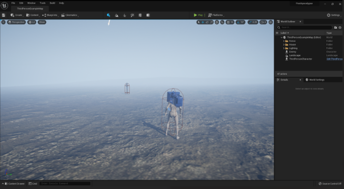
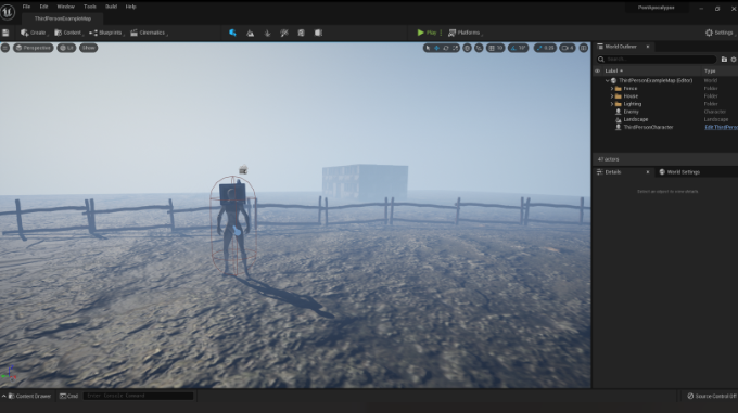
Around this time, I also created a plane for the game to take place on,
using Quixel to get texture for the floor, and had begun to map out the level.
Figure 3.0.3, Early Photo 1
Figure 3.0.4, Early Photo 2
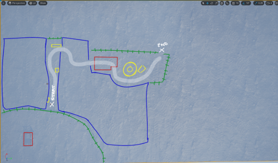
To further plan out the map, I took some screenshots of
different angles, like aerial view, and drew over them to
show what was going to be in each location. This marked my
original ides of minimal cover, and the idea of going through
a building.
Figure 3.0.5, Plan- Aerial View
Figure 3.0.6, Plan- Forward View
Figure 3.0.7, Plan- Backwards View
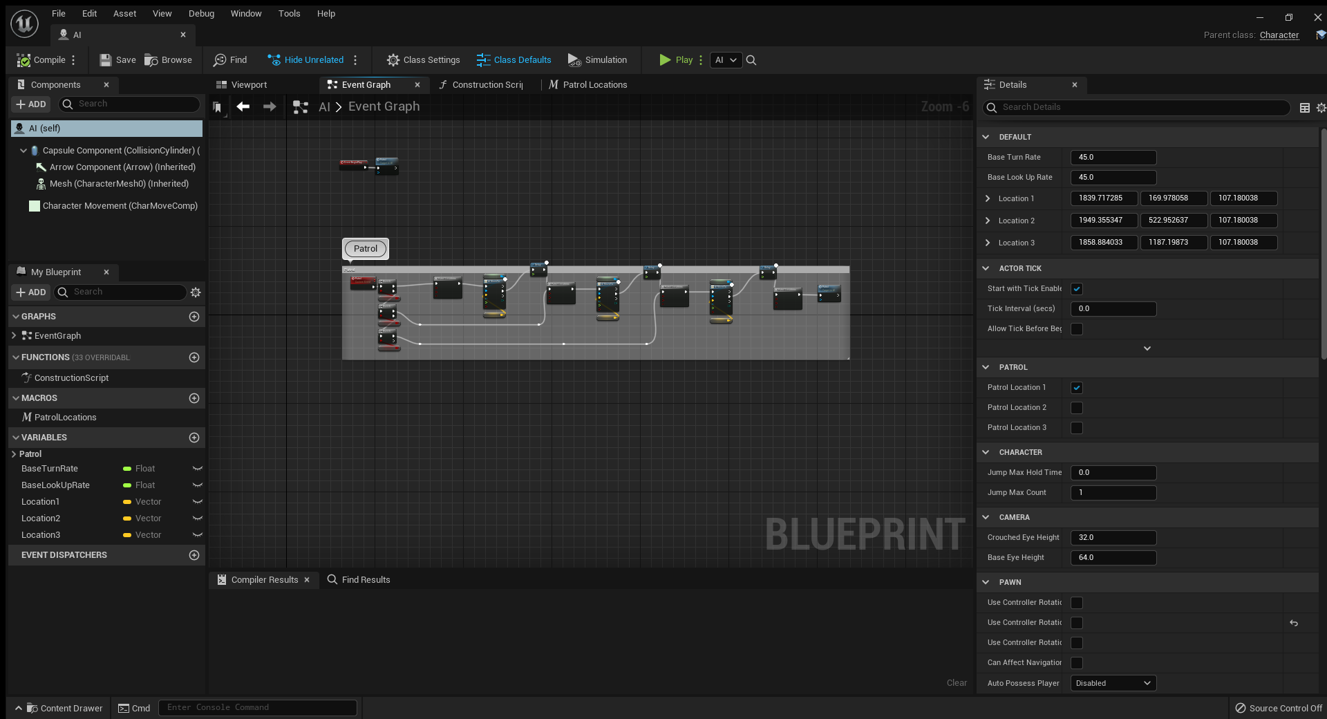
One of the main things I was trying to implement was an
AI patrol feature. I consulted many tutorials, but mainly
this
one. I wanted to create an enemy that would
patrol a location, and if they spot the player, give chase,
or end the level.
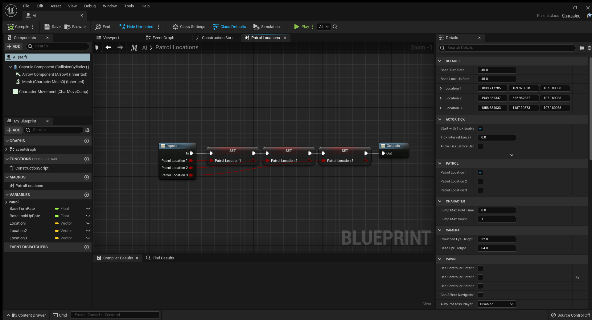
I have never used the blueprint system before,
but I was very excited to try it as I find coding
language very difficult to understand and write.
With the aid of the tutorial, I was able to create
these lines of commands:
Figure 3.0.8, Blueprint 1
Figure 3.0.8, Blueprint 2
This is pretty much the same as in the video, but
for some reason it did not work. My AI would not
patrol, or even work with the animations, not idling
and just staying in a default ‘T’ position. I ended
up spending far too long trying to fix this issue
and decided to move onto building the level.
Figure 3.0.9, AI
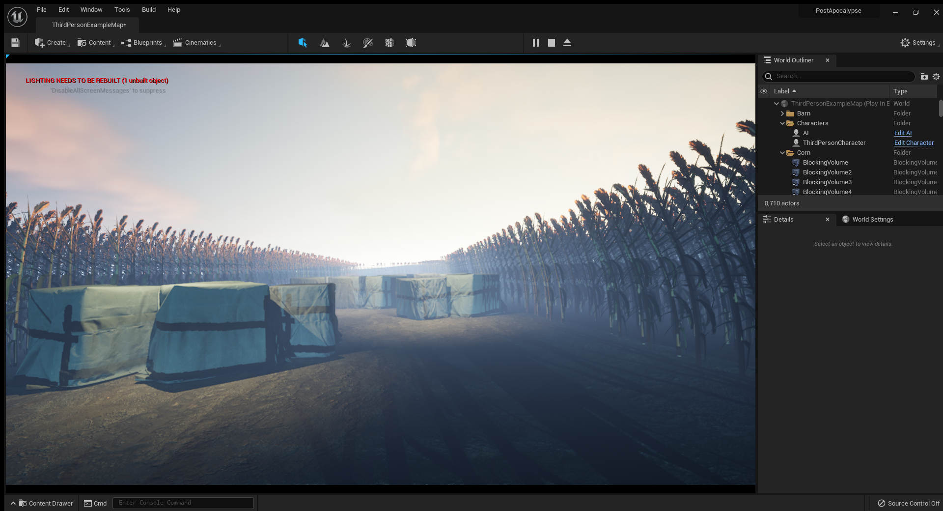
LEVEL BUILDING 3.1
The first thing I decided to create was the
cover for the player. Originally, I was going
to build up cover out of numerous items, stacks
of different and interesting things to hide behind
that looked as though they belonged in a farm.
Unfortunately, my Unreal Engine had an issue
where some of my assets became corrupt, and
after a few days of work, all the cover was
deleted. Although this was disheartening, I
actually think it was for the best: upon
revaluating the idea of cover, I decided
to go with a simple, reliable piece of cover.
This seems far more common in video games, where
assets are reused to give the player a sense of
reassurance and consistency, which seemed especially
important in a horror game. I did, however, get a
short video of the early production of my previous
work. It is in a much earlier stage than it ended up,
but it shows the original idea of building up cover
out of multiple items:
Figure 3.1.1 Early Cover
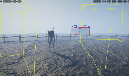
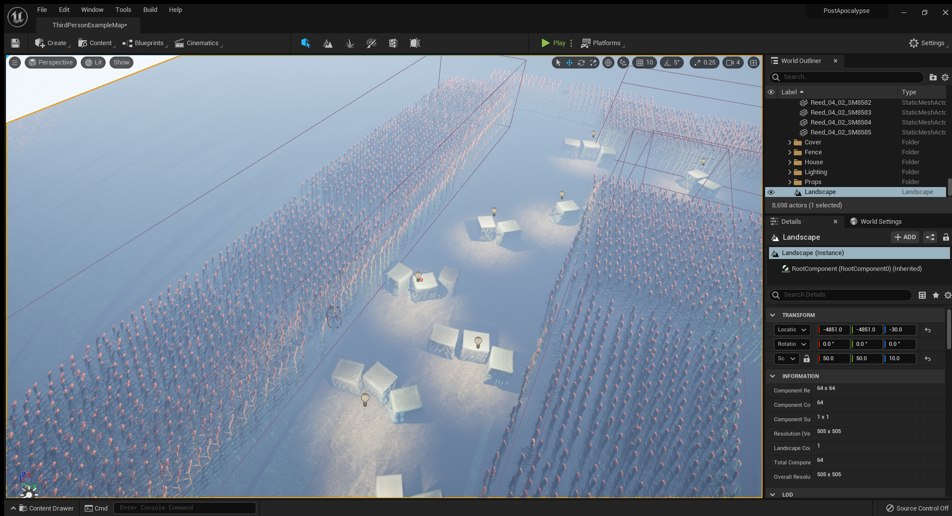
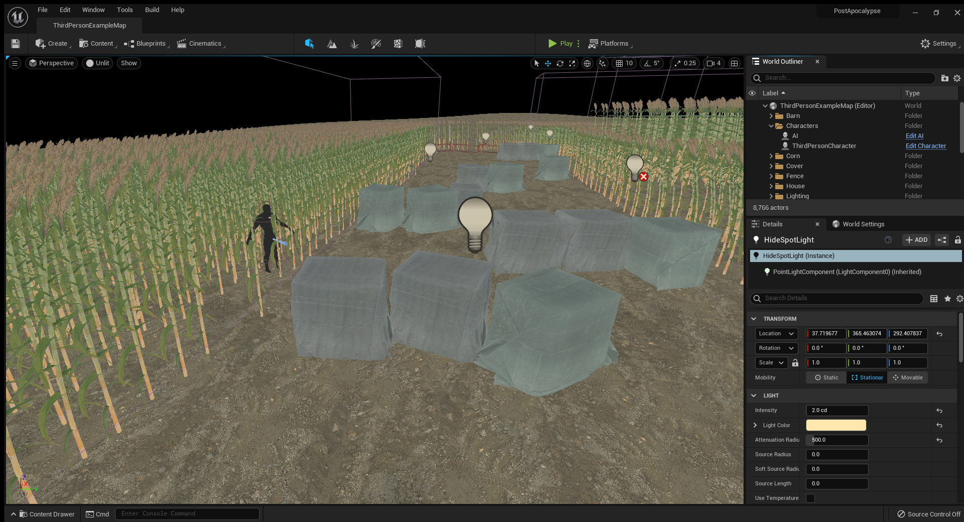
Later into production, I also added lights above the new crate covers,
to aid the player even more. At this point in the project, I also had
sourced many more models from Quixel, like the corn I had drawn in the
concept video. I had also changed the time of day to evening, and added
more atmospheric elements like clouds and fog.
Figure 3.1.2, Level Building 1
Figure 3.1.3, Level Building 2
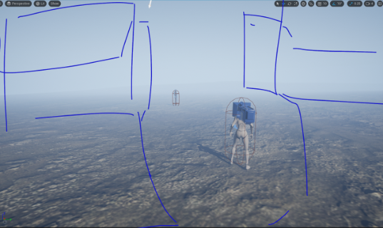
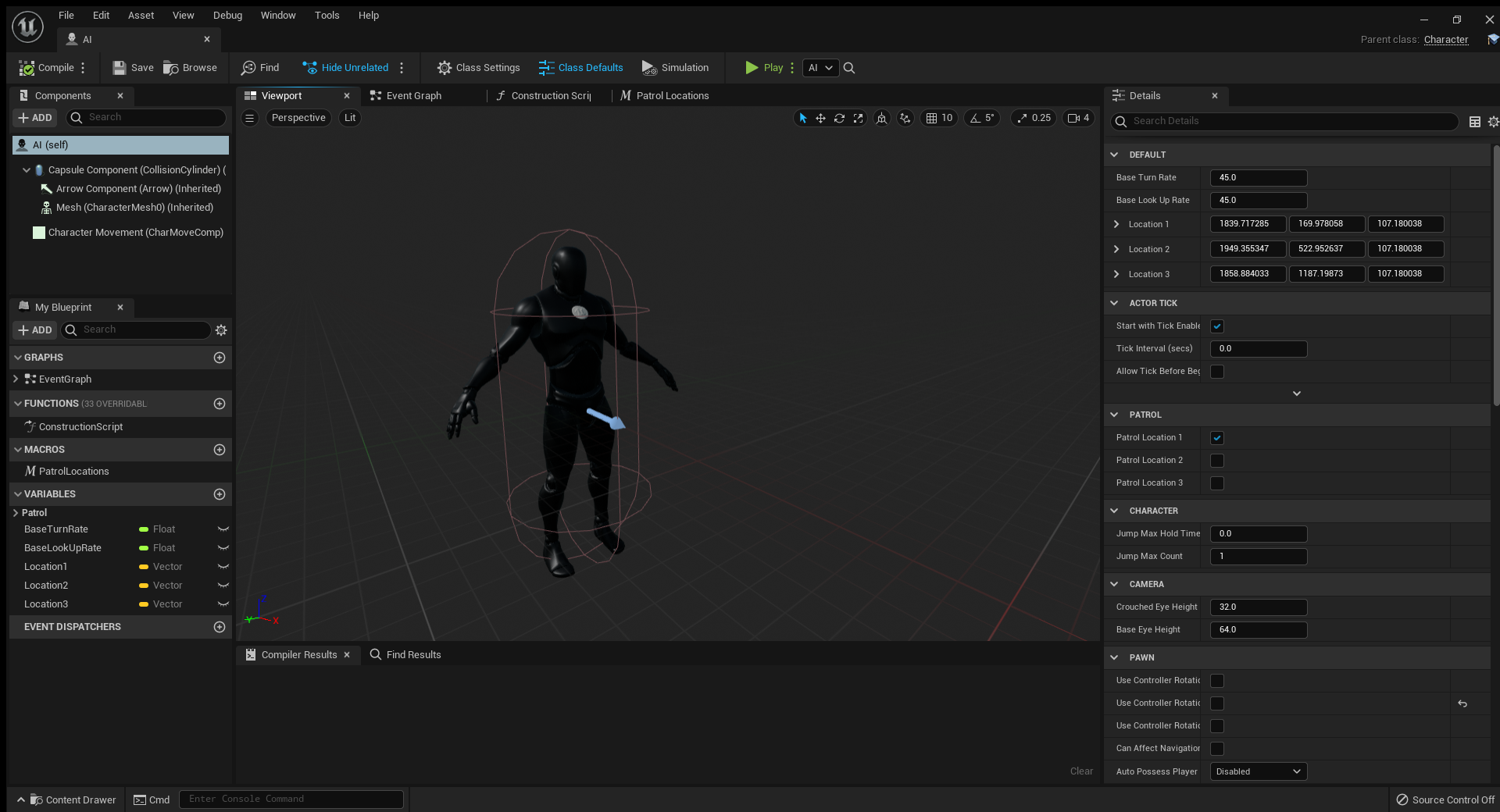
Once I had made this full stretch, I began to keep
trying with the AI, placing him off to the side, and
making his patrol coordinates correspond with his location:
this way he would emerge from the corn to check nearby pieces
of cover, giving the player minimal time to hide and navigate.
However, I still could not get this to work, so he is still
hidden to the side with all his scripts and programming,
just unable to use them.
Figure 3.1.4, AI Placement
Here is a gameplay test of the current elements in play:
Figure 3.1.5 Gameplay Test
I tried a few more elements, like a menu, but I’m not sure if it
was due to something on my end, due to my inexperience in Unreal,
or due to the fact I was using Unreal 5 which is currently unstable,
but I had a series of strange glitches when trying to do this. Every
time I would make a blank scene and try to make a menu, the camera would
not be static, instead, a new 1st person character would spawn, and start
falling through the floor. Neither of my lecturers knew why, so I continued
to focus on making the level playable and pleasing to look at.
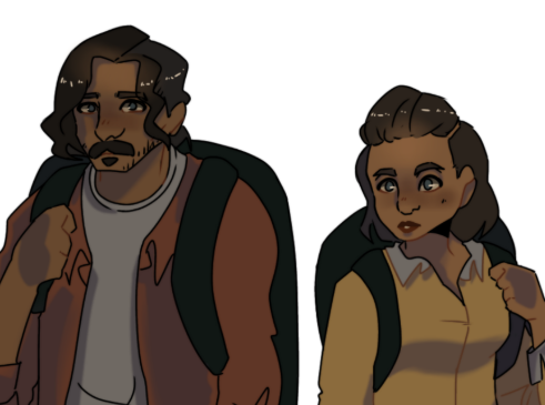
PLAYER CHARACTER DESIGN 3.2
With the final presentation coming up, our group were talking about
the idea of designing a player character. Obviously with the time
constraints, it would be highly unlikely to have a human character
modelled, rigged, textured, and in the game, but it would be a nice
element to be able to present. We ended up deciding to have a choice
of two player characters: similar to Leon and Claire in Resident Evil 2.
I wanted to make the characters as relatable as possible: this is
frequently the trope with vr or 1st person characters: the player
is really meant to relate to and see themself in the character. At
the same time, video game characters, particularly in the horror genre,
seem to be a projection of one’s best self. Fictional characters are
often role models, or the kind of people that players can admire and
strive to be like. Especially in the afore mentioned Resident Evil
franchise, the male and female characters are seemingly exaggerated
versions of these aspirations: a lot of people point this out as a
negative and claim that horror games present women in a sexualised
and unrealistic way, but I do not think that any horror protagonist,
male or female, is ‘realistic’. In fact, I would argue that it would
be easier for an average female gamer to achieve a similar body, through
working out and such, to Claire Redfield, than it would be for a male gamer
to achieve a body similar to Chris Redfield. So, I began to experiment with
the middle ground of being almost a blank slate, and relatable, and being
something more, like a role model.
Another thing to consider, is that I wanted the choice to have no
effect on the gameplay. Choosing to play as a male or female character
is mostly just for a personal preference, and I wanted them to each be
as capable as each other.
Design wise, I went with a medium skin tone. I wanted the race
of the characters to be slightly ambiguous, and as relatable to
as many players as possible. I also decided to make the two characters
appear visually similar, leading to the choice to have them as brother
and sister. In their design, I stuck to similar colour pallets, and
wrote a short description out for each one.
Figure 3.2.1, Character Design 1
Figure 3.2.2, Character Design 2
FINAL PRESENTATION 4.0
For the final presentation, I showed all the above
work, along side a gameplay mock-up I had made
specifically for the presentation. This showed
elements that I was unable to achieve in the engine,
like a menu and title screen, and merged it with what
I had created. For some reason, my laptop was very buggy
at the time of recording the footage, but other than that,
I am happy with the outcome:
Figure 3.1.5 Gameplay Test
Overall, the pitch went pretty well: unfortunately, due to illness,
or unknown reasons, only two members of my group showed up for the
presentation. After such successful teamwork up until this point,
it was a little disappointing to have it fall at the last moment,
but it wasn’t the end of the world. The lecturers recommended that
I keep working on the game after the project to take it even further,
so I continued making some changes.
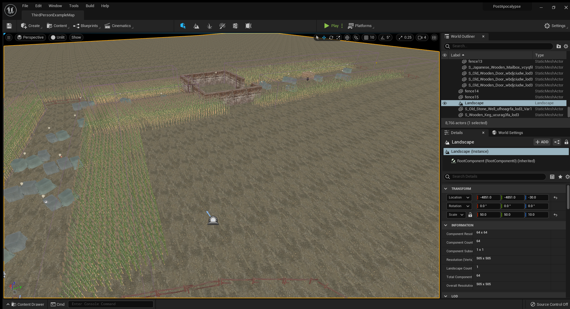
FURTHER PROGRESS 4.1
I worked a bit more on the game, mostly, making
it have a linear progression, and fleshing out the
whole level. I attempted to add a barn, but could
not find adequate models on Quixel, so I had to build
the walls and texture it. I also added more cover, and
more lights, and a well- which I had drawn in my initial
plan- until the end of the level.
I would have enjoyed working on it more, but by this
point the next group project was set, so I set my priorities
on my new assigned work.
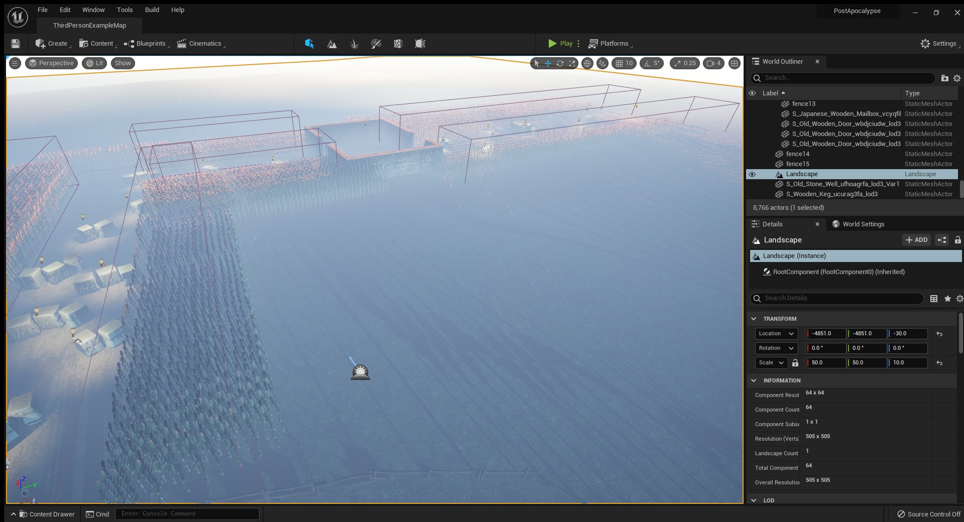
Here is the final video and photos that I took of game:
Figure 4.1.1, Aerial Map- Lit
Figure 4.1.2, Aerial Map- Unlit
Figure 3.1.5 Gameplay Test
CONCLUSION 5.0
Overall, I really enjoyed this project. If I were
to describe it simply, it has been a huge learning curve
for me. Beginning to tackle Unreal Engine was a huge challenge,
which I’m not sure I was totally ready for, but I hope to put in
more of my personal time to improve for the future.
Another positive, was the group work. Much different from my last
project, everyone was supporting each other, and seemed to work well
together, which was really refreshing. It also became obvious towards
the beginning of the project, that I was working with a lot of
introverted people, so they often looked to me for leadership
during presentations and such, which I found helped me to broaden
my skills as a team leader.
This project was very helpful, and I look forward to using
Unreal again in the future.